Post by Lana Del Ray on Mar 8, 2012 5:45:49 GMT -7
Hello Girls!!!
Welcome to your First Judging Session. I always hate the first elimination . Let's start our judging now!!! This week you girls need to portray you addiction in a photo. Let's see how you did this week.
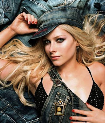
Janice: Obviously, you love those jeans. You're surrounded by jeans. Even your hat is denim. But you're just looking at the camera being pretty. Where's the addiction? I want to see passion. I want to see emotion!
I want to see more of this image too. It's not that hard to find a bigger version of the image. Try copying the image url, pasting into a google search, and click "Search this image".
Morgan: Well I can see your addiction in this photo so that's a good start! I'm a big fan of jeans myself. And you do look pretty here, but that's just it.. only pretty. This photo doesn't scream interesting or give me anything memorable about it, I want to "ooh" and "ahhh" at your photo, not to just go "oh" and that's it. Gotta have some spark! But having jeans as a addiction was a clever idea and you conveyed that very well.
Janice: You mustn't be looking hard enough, Avril. A higher resolution image is incredibly easy to find.
Lana: You're so mean, Janice ..
..
I've a friend who has an obsession towards Jeans. I wish you would shown more passion in the photo. Do something crazy with the jeans. Overall, you look great Avril!!!
Amanda: You look great, and I enjoy the concept - it's something unique that we don't typically ponder addiction to, and going on a shopping binge for a particular type of item is something that can qualify. The styling is impeccable and you look fantastic - I love your hair. And you have a hat. You know me - I love my hat
I find this to be sexy, but it is indeed somewhat devoid of emotion - but I think that actually WORKS for this photo, since jeans ARE your passion. You're showing off your love for denim. You're showing off that denim makes you sexy. I really don't think deeper emotion is required given what you're addicted to. It's a more healthy addiction - it's one that makes you sexy. I like it. Good work!
Zooey: The more I think about this photo, the more I like it. Not only do you have the denim hat and the overalls, but you're also surrounded by jeans. I agree with Janice that I would like to see more passion from you, though. This is an addiction, so there needs to be a more intense emotion.

Amanda: Rebellion, eh...? I'm not sure if I can see how a rebellious nature is something addictive. It's a part of who you are. This looks more like a throwback than anything - trying to restore fashion styles from the 50s or 60s, and the fact that you have a Harley shows that more than it shows "rebellion." I know non-rebellious people that drive Harleys, but then again I live within an hour of their headquarters, so that might just be me. I like this photo since it's a unique, artistic concept, and you do seem to be enjoying yourself, but I can't translate what you're selling here. I don't see it, and I don't love this photo enough to look past that. It's not a major cause for concern early on, but... I'm really uncertain how I'm going to rank this :/
Lana: I like the photo. But rebellion? If this is a Persona shoot, Rebellion would be a perfect choice for your photo. But I agree with Amanda, You look great, confident and gorgeous in this photo.
Janice: I have a problem with the quality of the photo, it's kind of hard to see. You know what, I agree with Lana. This is better for a persona, not an addiction. Those legs are amazing, Christina. Your modelling is A+ here, but your execution is awful.
Zooey: Howdy y'all. Are we in a cave, cause I think I hear an echo, echo, echo, echo. I have to agree with Lana and Janice that this photo would have worked much better for Persona than for Addiction. I applaud you for trying to think outside the box and go with an unexpected addiction. Unfortunately, it didn't translate as well as I'm sure you intended. Once again, echoing Janice, you're doing a great job modeling, but the picture's just not fully there
Morgan: I think you look excellent here, you have a great arched back, long legs and a very "party rock chick image" going on here. However you look super super bright here which I think can steal detail away from you and your body. I can see rebellion in this, you appear to be living life on the edge but that being said I wouldn't have guessed this photo to be a rebellion picture without being told so.

Janice: I love the angle of that face, it's a really risky angle, especially in this competition, but I for one am a fan. You really look like you are basking in that attention, something that I know all about! That's the theme hit, but your modelling. Your left arm is amputated, and that dress makes you look like your hips and legs are fat. It looks like you've been gorging on McDonald's for the past 10 years, and it's all gone to your hips!
Morgan: I can see attention seeking all through this! I love how this photo really captures that addiction, and you look glamorous here. I do agree with Janice with the arm amputation thing it doesn't look too appealing, and how the dress does look unflattering on your hips. But overall this is an impressive shot for the first round for me.
Lana: Love It!!! You're such a camwhore, Dannii!!! I can feel your 'lust' towards the attention. Even though, the angle of your face is not really strategic but I think you manage to portray your addiction well. Good job
Amanda: I really could never draw a line to an addiction here, but your explanation and realizing that there are media whores in the windows have sold me. You definitely command attention, not to mention you look voluptuous and... that dress is awesome. I don't take issue with the arm, since given how your other one is, I can presume your body is simply in front of it. It's a sultry, sexy pose, and it works real well. Great work
Zooey: Thank you for saying "attention" and not "sex". Saying you're addicted to attention is definitely a better way to sell this photo. I wish we could see you a bit better in this photo, but we can still see you well enough to make out what we need to. You definitely seem to be basking in the attention of all the photographers and it's a pretty strong photo. Good start to the competition.

Morgan: Dianna! You look like you have a gimpy eye or something, your face does not look flattering in this. It looks very morphed and just... not pretty. However I like the intimacy and how the closeness of your two bodies was done so well, I can definitely see self love or even desire in this. This is a creative idea. But...your face! It's so off putting, and where did you get so much hair!?
Janice: What happened to your face. The part that isn't reflected looks gorgeous! But then we reflect it, and you look like you fell down and died. There is not life in that reflection, but the part that is your profile is good. But we need someone who is not just a profile model.
Lana: I love this photo so much!!! I think your face is appropriate here. You need to give us addiction. You don't expect someone who's an addict to look pretty and in-control always. You shown desire, addiction and your styling, those big, crazy hair.. I'm a fan!!!
Amanda: I'm not a fan of this. For one, you don't look beautiful, and that's because your hair looks far beyond your years, and that shirt is a little too much for me. Your eyes here are sort of weak, although you do make a point that you adore you and you're trying to kiss yourself. That whole thing seems just wrong to me. I get the idea, but it makes me uncomfortable, and there's nothing in this photo that makes it pop out to me. Give us passion! Show us that you ARE passionate about being in love with your own reflection. Because this seems sort of forced.
Zooey: Ok, so definitely good news and bad news coming from me.
Good news: I love the route you took with your theme this week and your pose works wonderfully with your addiction. Also, I love that you chose to be addicted to yourself when you've been "liking" every single post you've made since you created your account.
Bad news: For someone so obsessed with themselves, you sure do look horrid. I agree with the judge(s) who have commented on the weirdness of your eyes in this photo. I also hate your hair in this picture.
So, this week, when it comes to weighing your picture, it'll be theme vs quality. You did a great job with the theme, but the styling of the photo suffered for it. While I want wear and "ugliness" with several other addiction photos this round, because you are addicted to yourself and beauty, I would like to have seen you actually look beautiful in this picture.
In the end, though, I still have to give you high points on the theme.

Amanda: The lack of a setting almost kills this. It's so... BLANK. It's so... DULL. You're in a white room, talking on a telephone that isn't even plugged in. I do like the red, as it makes you pop, and it's a sexy styling, but your expression is... almost unbearable. I strongly dislike it. You're laughing at something your girlfriend just said, but given the angle and the lack of a setting, it stands out in a negative light. This is overall a decent photo - but it's nothing spectacular; thankfully, at this early stage, you really don't need it to be spectacular if it isn't a suicide mission. Which this isn't, either.
Lana: Yeah, the setting was just so blank. I like the styling and your face too. You make this crazy & ugly face which is suitable for the theme this week. I get your addiction here. Overall, it's an average photo.
Janice: I am looking at a reflection of myself here! This is the kind of stuff I used to do! I love your energy! You really look like you're enjoying yourself, and it's deranged enough to work for this shoot. I like the choice with the background, it shows the obsession that addiction brings: Seeing only the one item.
Morgan: I think this photo is too fake and posey. Your body looks stiff, the hand on the floor looks awkward, theres tightness in your adomen and your 'smile' looks creepy. I like the consistency in the colour, but the addiction element doesnt stand out to me. I want to see a passionate, real, natural addiction and this photo just doesnt do that for me.
Zooey: I'm torn about this photo. I both like and hate it. I agree with Morgan that it's too "fake and posey", but at the same time, you look like a psycho on the phone. I wouldn't get near you looking like that. I'm fine with the photo, but I don't feel that strong of a connection between you and your addiction.
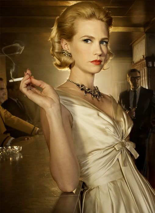
Amanda: Safe, yes. That's not really a bad thing. You look gorgeous, and the addiction here is obvious - smoking has become so routine to you that you don't even need to be conscious of the cig you're holding. I can see this as a throwback ad, but it has a modern edge. I really enjoy this. Especially the styling and the setting. A bar works so well. Great work
Lana: I really like your face here. I can feel the story behind this photo. The styling is great. I think you manage to inject the fashion value in your photo. A great start from you, Jan!!!
Janice: You look a million years old here, but I'm willing to forgive that, because I love the old fifties vibe you bring here, and also how you thought outside the box. I love the idea of showing how people become addicted to it: The glamor. People wanted to be smokers because it was cool.
Zooey: The cigarette is completely incidental in this picture and that's not conducive to a good Addiction photo shoot. I do like this as a period piece, though. It has some interesting elements to it, which will make me prefer it over the other models who took the theme of addiction to mean "find something in a picture and say you're addicted to it".
Morgan: I think you look quite beautiful here, the styling and setting is great and everything fits well in this photo. Your explanation is well thought out and compliments the photo well, it really gives a different perspective and so much more meaning to this photo. I can now see the innocence to this addiction and yet the hold that it has on you at the same time. Well done
Edit: I somehow missed actually reading your explanation, but after reading what you wrote I have a different view of this shot

Amanda: Addicted to... wearing rings? That's sort of strange in my eyes. What I like the least about this photo... well, there are several things. One, you're only showing one hand, so we can't see the 3-4 rings on your other hand. Two, your eyes are closed, and that takes away more than it adds, as it makes this photo devoid of emotion. Three, this photo is very zoomed-in, and we don't really get to see you modeling anything BUT the rings. I do like the lipstick, but that detracts from the rings, which are supposed to be the focus. That's... kind of a problem. Sorry, I'm not really feeling this :/
Janice: This would work better in a shoot where you're selling something. Addiction I don't see. But you look really good. This is an amazing beauty photo. I really didn't expect something like this from you. It's very fashion forward.
Zooey: This photo is a start, but you haven't quite reached the addiction level. I see no passion or emotion from you in this picture and an addiction is deeply personal to a person and I'd expect to a great deal of emotion. Maybe even just your ring hand being clutched would have made this photo so much better. A clutched hand would have at least shown some protectiveness over your rings. As of right now, this photo just looks like a woman showing off her ring collection.
Morgan: This comes across to me as being a very glamorous MySpace shot (yes I may be old but I'm still up with the hip new things). Where's the passion for these rings! And where is your collection, I want to see more than 4 rings on one hand. You do however look gorgeous and flawless, like a china doll who owns expensive jewelry.
Lana: Wow!!! You look beautiful but i'm not sure with your addiction. But overall, i think you did a good job.

Amanda: Purses. Plural. If you're addicted to purses, why isn't your dress made out of them? Why is there only ONE purse here? Why aren't you bathing in a sea of designer purses? Granted, that purse is fabulous, but it also steals the spotlight from you. I'm going to remember the purse more than you. And still... it's just one purse. You seem to really like THAT purse. You do look great, I will give you that, and I do like the setting, but... I'm not feeling the connection here. Sorry :/
Janice: You look deranged! This is fabulous! It's a really high end photograph! I think this is an extraordinary start to the competition!
Zooey: I'm not as enthusiastic as Janice over here, but I do still like your photo. You do have a bit of the crazy eyes, which I'm going to assume you got from Tom Cruise. You do look a bit overprotective of your purse, which lends some credibility to you being addicted to your purse. Should be a good start for you in the competition.
Morgan: I see Golem in this photo! This purse certainly looks like "your preciousss" and your modelling is very strong in this photo, you really do stand out in this. I do agree with Amanda that one purse doesn't really convey a addiction, but you certainly do look very protective of this certain purse like you would scratch someones eyes out if they came near it *gulp*. Overall the modelling impresses me the most in this.
Lana: great photo. The fashion value in this photo is really strong. Love ur eye contact with the camera. I think this photo would be better if we get to see more purses. So you can highlight your addiction more.

Amanda: I don't like the styling. It's covering you up a little bit. That aside, I really like this - it shows smoking well, and the black and white is an awesome addition, since it shows how bad smoking is - it takes the color out of the world. I like your hair and your face, since you just took a puff, but the way that jacket covers you is... iffy. Not too big an issue though. Overall, this is good
Lana: Another smoking photo!! What I like about this photo is it is different than the other one. It's very dark, sad, gloomy. I like your styling. And your eyes in this photo, just wow!!! Good job!!!
Morgan: I actually like this, it has a darkness in this addiction and the smoking element stands out well. You look a little under the influence of tobacco, looking a bit relaxed and spacy but it compliments the addiction. The only thing I dont like about this is the shadowing over your face, I want to see you standing out and your haircut is god awful in my opinon. I like my ladies minus the boyish shaven fringe.
Janice: What happened to your hair? You look like you're bald. You need a better wig, honey. It also looks like you're wearing a chair. You're not wearing it well. You have the whole smoking addiction going for you, but at the cost of everything else.
Zooey: Premature greying and hair loss is a side effect of smoking, so maybe that's what's wrong with her hair in this photo. I actually like the look on your face in this photo. It's that look you see on someone's face when they really need a cigarette and then finally take that first drag. So, I can see this photo working as a satisfaction of your addiction, but I would have preferred to see a photo of your desire for your addiction or further consequences of your addiction and its side effects rather than just "bad hair". In the end, this photo is fine, though.
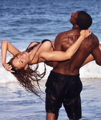
Janice: You seem less connected to him and more connected to the camera. If you were really addicted to him, you would be all over him. You wouldn't be able to keep your eyes off him. He seems to think you're a bit fat. Look at that pained expression on his face. You do look like a commercial model here, though.
Morgan: I'm half and half about this photo, it has an awkward feel to me, and yet it also has that natural feeling. You both look comfortable together and you appear genuinely happy and content in his arms, so that adds weight to the addiction that you chose. I think the problem that I probably have with it the most is that its too natural, your eyes are squinted, I can only see half of your body, and I can't take my eyes away from your boobs which look like they are about to pop out at any second. I do like the connection and closeness here between you and Nick, but I don't know if I would classify it to the extent of being an addiction.
Lana: Same with me. I'm not really sure with your choice of addiction. It was too sweet for an addiction. You look beautiful though. Your energy is good but there's nothing really memorable about this photo
Amanda: Cliche. Really poor choice of addiction here. This is just too positive. I can see the connection between you two, but you're playing around more than anything. You're just having too much fun - this definitely looks candid, even if it isn't. The pose is awkwardly unique, but like Morgan said, it's natural. I like the idea behind this somewhat, but 1) it doesn't suit the theme too well, 2) it's just awkward, and 3) it's almost a candid. Despite that, I don't hate it - it's just... yeah. It could be so much more, and it would definitely work better for a "Love" theme.
Zooey: This picture isn't doing it for me. If you're addicted to him, why doesn't he have your full, undivided attention? You have a nice smile, but that's about the only think I like about this picture. Sorry girl.

Janice: It looks like the batteries in your vibrator are on overdrive, because you expression and your body language are hot. That stool looks like more than a stool, because you face looks like you are in a great amount of pleasure. I think it's a good shot, and it's great that you committed to that emotion.
Amanda: This gives me an extreme vibe of "lust" which does sell for "addiction to sex" and given where your hand is... yeah. This is VERY hot, but at the same time, the lack of a setting, the lack of a story, the lack of a romantic partner... all of that hurts. This is merely a starting point, in my eyes - it's something to build upon, something to better, something to make more complete. Because right now, all you have is the YOU. It's a good shot, but it's lacking all of the things it needs to be fantastic - but this early on, it's good enough to keep you alive.
Morgan: *sings* Its getting hot in here! I'm going to take off all my clothes!
Now this is an addiction, I can see intensity, desire and passion written all over this, not to mention that this photo is just pure hot anyway. Your face looks a little ugly here, but its model ugly which translates it to being good ugly. You have a real expression on your face, not a posed one which really makes this photo for me.
Zooey: I have to agree with Amanda: this is a start. The look on your face, the outfit, and the pose all work well enough towards you theme, but the lack of a stronger context in the picture keep it from reaching that next level where it could be a stunning photo. Decent job this week, though.
Lana: Wow, never thought I'm going to see this side of you, Rachel!!! I'm expecting you to be commercial ad pretty but you look way edgy in this shoot. Not a fan of the setting plus the B&W, but I think you picked the right addiction and you executed it very well

Morgan: Hrmm, this photo doesn't appeal to me actually. You look like your more in pain than feeling pleasure, and the pose looks twisted and awkward. Also seeing your hand at the back and not seeing your arm makes it look kinda freaky. I can see how you would view this photo as representing sex addiction, it does have the bedroom element and the skimpy sexy clothing, so I can see concept matches there.
Janice: All you have going for you is your skimpy outfit. That's not enough. Setting and clothing isn't what makes a photograph. We need you to model, because right now, it looks like the batteries died in your vibrator.
Lana: I think the styling is very simple but still sexy. I want to see more lust in your face. More attitude is needed for this kind of addiction. You were supposed to be "hungry" here!!!
Amanda: Wut.
Seriously. That's really all I have to say. I see "sexy" here, but I don't see "addiction to sex." You -are- sexy, but that's -all- you have going for you. I like your hair actually. But let's go over what I don't like:
1) The concept of intimate sexual relations are not portrayed in this photo in the slightest - you don't even have a lover in here, you're just a lonely woman on a bed waiting for James Bond to come in and seduce her.
2) The angle of your face. We can hardly see you. We can hardly feel the emotion. That's why I say you're lonely, because I can't see anything else. You're waiting for him, but is he coming?
3) The setting is BORING. Sex is about an intimate array of passion, a lighting bolt being struck into two hearts simultaneously, a rubbing of two kindles of love! I don't see ANYTHING in this setting that goes along with that passion.
All three of those are major problems. This photo does absolutely nothing for me. It's a sexy photo but that's it. It doesn't represent sex addiction to the same extent it represents a simple "sexy" and that's easy to do. Show us passion. Show us that you're craving it! The only connection I can make is that you're lonely without sex, which does relate to the theme, but that doesn't stand out. This could be so much more than it is. I like it somewhat, but I just can't connect the dots here. We want more FIRE. We want a burning passion here!
Rose decided to use her "Second Photo"

Janice: What a waste of the twist. You have 13 other girls, you don't know if they did worse or better. But on the plus side, this is better. You look bored and zoned out. Just how someone addicted to TV would look. I would have loved if this were taken to the next level with your modelling. A little repositioning of the body would have made this even better.
Amanda: Yeah, you used your second photo too early, but that won't cost you points - you've bettered your odds of staying regardless. You're a zombie here. It's great. Your styling is better. You're more memorable. I personally like the pose - it's NOT sexy because you're hypnotized by the TV. It's believable, and... you need a nap! Go get some rest!
Zooey: Since you've used your twist photo, I won't spend much time talking about the first photo except to say that the second is soooooooooo much better than the first. I don't have a problem with you using your twist photo the first round because somebody has to be first out and honestly, that first picture could have made you be the first out. Now, you definitely stand a better chance this week.
Television most definitely can be an addiction for some people and I believe you in this picture. You are definitely addicted to that tv. Your posture is great for the theme and I love how close you are to the tv itself. It suggests that you just can't get enough of it.
First photo: bad, boring, predictable addiction.
Second photo: interesting, believable, less predictable addiction.
Great job with the second photo.
Morgan: I agree I think this photo is a lot better, and we can see the object of addiction in this one very clearly. You look hypnotized and I can fully believe that you are addicted to television, your body posture and face say it all. You don't seem to be putting any effort into modelling in this, which is something that I usually like to see, but in this photo that works well for you because it keeps the addiction element believable and natural.
Lana: I don't think you waste the chance. I mean, it's now or never. And your second photo, is way better than your first one. I love the way you look at the television. The styling is good. Very gloomy and intense.

Amanda: I can see a sort of addiction to yoga in this photo, but only a sort - it's not strong, it's not striking, and worst of all, this photo isn't memorable in the slightest. You look like a Wii Fit instructor. It's not high-fashion. You're not even looking at the camera. I can't see any emotion. The setting is blank. The outfit is boring. The Nike checkmark is what stands out the most to me, and that's not designer fashion at all. Given that the translation to the theme is somewhat lacking, there's really not much this photo does for me. I'm going to go judge a few others now... and I probably won't remember this one after. Sorry :/
Lana: Oh no Sarah.. This isn't working. There's no passion and I think it's too "soft" for the Addiction. I don't think the setting and even your styling helping you this week. I think you can do way better than this
Janice:
Seriously, what the hell were you thinking?! It's boring and you look like you've contracted tetanus. There's no passion. There's no modelling. There's no fashion content. There's no anything.
Zooey: I appreciated that you tried to think outside the box for this shoot and there are people addicted to working out. There are even people who get hospitalized because they work out to excess amounts. If you're going to go with a fitness related addiction, I need to see the wear on your body. You need to be thin to an unhealthy degree from burning way too many calories from your workout addiction. Unfortunately with this yoga addiction, you just look like a fitness model on a dvd or pieve of workout equipment. You look like you enjoy working out, but you're not addicted to it.
Thank you for trying something different, but this fell short of the mark.
Morgan: Your posture and modelling work well for me here, the pointing of the feet and lengthening of the limbs. But the addiction element is lacking in this. I agree with Zoe in that, this looks like a photo taken during one of your routinal yoga sessions so it doesn't have anything special about it. I can see that you enjoy yoga, but I don't see the passion and it being something you can't live without. I think you picked a photo that had an addiction element that was quite weak, but addictions are ment to be strong!

Amanda: You definitely look sophisticated. You also definitely look loaded. Your expression wouldn't fly on almost any other photoshoot, but here it works - you're lost in translation, not even noticing that you're getting photographed, all because you had a bottle of wine on your own. I really like the setting - it's like this is telling a story of a trophy wife gone mad because her wealthy husband is seeing someone younger, and she resorts to raiding his wine cellar to satisfy her cravings. That's what makes this memorable. One thing that could make it even more striking is a small splotch of red on your dress - a wine stain you didn't notice, but it's nothing mandatory. This is still good, but it isn't great - it's not the most unique thing in the world, but it's still high-fashion and high-story, so that will greatly benefit you here. Good job!
Lana: Gosh!!! Beautiful, gorgeous. I love the sadness in your eyes. I can feel your addiction. It feels like you don't want to drink but you just can't avoid the attraction towards alcohol!!! Good styling. Overall good job!!!
Zooey: Ok, I didn't really have the time right now to sit down and critique everyone's photos, so I just took a quick glance at everyone's so far. However, I feel the need to really stop and comment on this photo right now because I love it. Finally an addiction that is more than "I am addicted to *this* cause it is also present in the photo." No, this one actually shows some wear on you and you are showing the addiction in your body, face, styling, everything. My personal favorite addiction picture out of both this Cycle and the Male Cycle. Great start, Zoe.
Janice: WORK IT GIRL! This photo is amazing! You look sophisticated, you look elegant. You look absolutely wasted. It looks like you're 100% committed to your photo, and your addiction. This is what I wanted to see!
Morgan: This is excellent, you really do somehow look elegant even though it looks like your are going to..
A) Puke
B) Bitch slap your cheating husband
C) continue sleeping with your eyes shut
You look unpredictable and completely under the influence, its obvious you are addicted to alcohol. The setting, your posture, your face and the way you still look fashionable and like a model makes this a great photo.
Welcome to your First Judging Session. I always hate the first elimination
 . Let's start our judging now!!! This week you girls need to portray you addiction in a photo. Let's see how you did this week.
Janice: Obviously, you love those jeans. You're surrounded by jeans. Even your hat is denim. But you're just looking at the camera being pretty. Where's the addiction? I want to see passion. I want to see emotion!
I want to see more of this image too. It's not that hard to find a bigger version of the image. Try copying the image url, pasting into a google search, and click "Search this image".
Morgan: Well I can see your addiction in this photo so that's a good start! I'm a big fan of jeans myself. And you do look pretty here, but that's just it.. only pretty. This photo doesn't scream interesting or give me anything memorable about it, I want to "ooh" and "ahhh" at your photo, not to just go "oh" and that's it. Gotta have some spark! But having jeans as a addiction was a clever idea and you conveyed that very well.
Janice: You mustn't be looking hard enough, Avril. A higher resolution image is incredibly easy to find.
Lana: You're so mean, Janice
 ..
.. I've a friend who has an obsession towards Jeans. I wish you would shown more passion in the photo. Do something crazy with the jeans. Overall, you look great Avril!!!
Amanda: You look great, and I enjoy the concept - it's something unique that we don't typically ponder addiction to, and going on a shopping binge for a particular type of item is something that can qualify. The styling is impeccable and you look fantastic - I love your hair. And you have a hat. You know me - I love my hat

I find this to be sexy, but it is indeed somewhat devoid of emotion - but I think that actually WORKS for this photo, since jeans ARE your passion. You're showing off your love for denim. You're showing off that denim makes you sexy. I really don't think deeper emotion is required given what you're addicted to. It's a more healthy addiction - it's one that makes you sexy. I like it. Good work!
Zooey: The more I think about this photo, the more I like it. Not only do you have the denim hat and the overalls, but you're also surrounded by jeans. I agree with Janice that I would like to see more passion from you, though. This is an addiction, so there needs to be a more intense emotion.

Amanda: Rebellion, eh...? I'm not sure if I can see how a rebellious nature is something addictive. It's a part of who you are. This looks more like a throwback than anything - trying to restore fashion styles from the 50s or 60s, and the fact that you have a Harley shows that more than it shows "rebellion." I know non-rebellious people that drive Harleys, but then again I live within an hour of their headquarters, so that might just be me. I like this photo since it's a unique, artistic concept, and you do seem to be enjoying yourself, but I can't translate what you're selling here. I don't see it, and I don't love this photo enough to look past that. It's not a major cause for concern early on, but... I'm really uncertain how I'm going to rank this :/
Lana: I like the photo. But rebellion? If this is a Persona shoot, Rebellion would be a perfect choice for your photo. But I agree with Amanda, You look great, confident and gorgeous in this photo.
Janice: I have a problem with the quality of the photo, it's kind of hard to see. You know what, I agree with Lana. This is better for a persona, not an addiction. Those legs are amazing, Christina. Your modelling is A+ here, but your execution is awful.
Zooey: Howdy y'all. Are we in a cave, cause I think I hear an echo, echo, echo, echo. I have to agree with Lana and Janice that this photo would have worked much better for Persona than for Addiction. I applaud you for trying to think outside the box and go with an unexpected addiction. Unfortunately, it didn't translate as well as I'm sure you intended. Once again, echoing Janice, you're doing a great job modeling, but the picture's just not fully there
Morgan: I think you look excellent here, you have a great arched back, long legs and a very "party rock chick image" going on here. However you look super super bright here which I think can steal detail away from you and your body. I can see rebellion in this, you appear to be living life on the edge but that being said I wouldn't have guessed this photo to be a rebellion picture without being told so.

Janice: I love the angle of that face, it's a really risky angle, especially in this competition, but I for one am a fan. You really look like you are basking in that attention, something that I know all about! That's the theme hit, but your modelling. Your left arm is amputated, and that dress makes you look like your hips and legs are fat. It looks like you've been gorging on McDonald's for the past 10 years, and it's all gone to your hips!
Morgan: I can see attention seeking all through this! I love how this photo really captures that addiction, and you look glamorous here. I do agree with Janice with the arm amputation thing it doesn't look too appealing, and how the dress does look unflattering on your hips. But overall this is an impressive shot for the first round for me.
Lana: Love It!!! You're such a camwhore, Dannii!!! I can feel your 'lust' towards the attention. Even though, the angle of your face is not really strategic but I think you manage to portray your addiction well. Good job
Amanda: I really could never draw a line to an addiction here, but your explanation and realizing that there are media whores in the windows have sold me. You definitely command attention, not to mention you look voluptuous and... that dress is awesome. I don't take issue with the arm, since given how your other one is, I can presume your body is simply in front of it. It's a sultry, sexy pose, and it works real well. Great work

Zooey: Thank you for saying "attention" and not "sex". Saying you're addicted to attention is definitely a better way to sell this photo. I wish we could see you a bit better in this photo, but we can still see you well enough to make out what we need to. You definitely seem to be basking in the attention of all the photographers and it's a pretty strong photo. Good start to the competition.

Morgan: Dianna! You look like you have a gimpy eye or something, your face does not look flattering in this. It looks very morphed and just... not pretty. However I like the intimacy and how the closeness of your two bodies was done so well, I can definitely see self love or even desire in this. This is a creative idea. But...your face! It's so off putting, and where did you get so much hair!?
Janice: What happened to your face. The part that isn't reflected looks gorgeous! But then we reflect it, and you look like you fell down and died. There is not life in that reflection, but the part that is your profile is good. But we need someone who is not just a profile model.
Lana: I love this photo so much!!! I think your face is appropriate here. You need to give us addiction. You don't expect someone who's an addict to look pretty and in-control always. You shown desire, addiction and your styling, those big, crazy hair.. I'm a fan!!!
Amanda: I'm not a fan of this. For one, you don't look beautiful, and that's because your hair looks far beyond your years, and that shirt is a little too much for me. Your eyes here are sort of weak, although you do make a point that you adore you and you're trying to kiss yourself. That whole thing seems just wrong to me. I get the idea, but it makes me uncomfortable, and there's nothing in this photo that makes it pop out to me. Give us passion! Show us that you ARE passionate about being in love with your own reflection. Because this seems sort of forced.
Zooey: Ok, so definitely good news and bad news coming from me.
Good news: I love the route you took with your theme this week and your pose works wonderfully with your addiction. Also, I love that you chose to be addicted to yourself when you've been "liking" every single post you've made since you created your account.
Bad news: For someone so obsessed with themselves, you sure do look horrid. I agree with the judge(s) who have commented on the weirdness of your eyes in this photo. I also hate your hair in this picture.
So, this week, when it comes to weighing your picture, it'll be theme vs quality. You did a great job with the theme, but the styling of the photo suffered for it. While I want wear and "ugliness" with several other addiction photos this round, because you are addicted to yourself and beauty, I would like to have seen you actually look beautiful in this picture.
In the end, though, I still have to give you high points on the theme.

Amanda: The lack of a setting almost kills this. It's so... BLANK. It's so... DULL. You're in a white room, talking on a telephone that isn't even plugged in. I do like the red, as it makes you pop, and it's a sexy styling, but your expression is... almost unbearable. I strongly dislike it. You're laughing at something your girlfriend just said, but given the angle and the lack of a setting, it stands out in a negative light. This is overall a decent photo - but it's nothing spectacular; thankfully, at this early stage, you really don't need it to be spectacular if it isn't a suicide mission. Which this isn't, either.
Lana: Yeah, the setting was just so blank. I like the styling and your face too. You make this crazy & ugly face which is suitable for the theme this week. I get your addiction here. Overall, it's an average photo.
Janice: I am looking at a reflection of myself here! This is the kind of stuff I used to do! I love your energy! You really look like you're enjoying yourself, and it's deranged enough to work for this shoot. I like the choice with the background, it shows the obsession that addiction brings: Seeing only the one item.
Morgan: I think this photo is too fake and posey. Your body looks stiff, the hand on the floor looks awkward, theres tightness in your adomen and your 'smile' looks creepy. I like the consistency in the colour, but the addiction element doesnt stand out to me. I want to see a passionate, real, natural addiction and this photo just doesnt do that for me.
Zooey: I'm torn about this photo. I both like and hate it. I agree with Morgan that it's too "fake and posey", but at the same time, you look like a psycho on the phone. I wouldn't get near you looking like that. I'm fine with the photo, but I don't feel that strong of a connection between you and your addiction.

Amanda: Safe, yes. That's not really a bad thing. You look gorgeous, and the addiction here is obvious - smoking has become so routine to you that you don't even need to be conscious of the cig you're holding. I can see this as a throwback ad, but it has a modern edge. I really enjoy this. Especially the styling and the setting. A bar works so well. Great work

Lana: I really like your face here. I can feel the story behind this photo. The styling is great. I think you manage to inject the fashion value in your photo. A great start from you, Jan!!!
Janice: You look a million years old here, but I'm willing to forgive that, because I love the old fifties vibe you bring here, and also how you thought outside the box. I love the idea of showing how people become addicted to it: The glamor. People wanted to be smokers because it was cool.
Zooey: The cigarette is completely incidental in this picture and that's not conducive to a good Addiction photo shoot. I do like this as a period piece, though. It has some interesting elements to it, which will make me prefer it over the other models who took the theme of addiction to mean "find something in a picture and say you're addicted to it".
Morgan: I think you look quite beautiful here, the styling and setting is great and everything fits well in this photo. Your explanation is well thought out and compliments the photo well, it really gives a different perspective and so much more meaning to this photo. I can now see the innocence to this addiction and yet the hold that it has on you at the same time. Well done

Edit: I somehow missed actually reading your explanation, but after reading what you wrote I have a different view of this shot


Amanda: Addicted to... wearing rings? That's sort of strange in my eyes. What I like the least about this photo... well, there are several things. One, you're only showing one hand, so we can't see the 3-4 rings on your other hand. Two, your eyes are closed, and that takes away more than it adds, as it makes this photo devoid of emotion. Three, this photo is very zoomed-in, and we don't really get to see you modeling anything BUT the rings. I do like the lipstick, but that detracts from the rings, which are supposed to be the focus. That's... kind of a problem. Sorry, I'm not really feeling this :/
Janice: This would work better in a shoot where you're selling something. Addiction I don't see. But you look really good. This is an amazing beauty photo. I really didn't expect something like this from you. It's very fashion forward.
Zooey: This photo is a start, but you haven't quite reached the addiction level. I see no passion or emotion from you in this picture and an addiction is deeply personal to a person and I'd expect to a great deal of emotion. Maybe even just your ring hand being clutched would have made this photo so much better. A clutched hand would have at least shown some protectiveness over your rings. As of right now, this photo just looks like a woman showing off her ring collection.
Morgan: This comes across to me as being a very glamorous MySpace shot (yes I may be old but I'm still up with the hip new things). Where's the passion for these rings! And where is your collection, I want to see more than 4 rings on one hand. You do however look gorgeous and flawless, like a china doll who owns expensive jewelry.
Lana: Wow!!! You look beautiful but i'm not sure with your addiction. But overall, i think you did a good job.

Amanda: Purses. Plural. If you're addicted to purses, why isn't your dress made out of them? Why is there only ONE purse here? Why aren't you bathing in a sea of designer purses? Granted, that purse is fabulous, but it also steals the spotlight from you. I'm going to remember the purse more than you. And still... it's just one purse. You seem to really like THAT purse. You do look great, I will give you that, and I do like the setting, but... I'm not feeling the connection here. Sorry :/
Janice: You look deranged! This is fabulous! It's a really high end photograph! I think this is an extraordinary start to the competition!
Zooey: I'm not as enthusiastic as Janice over here, but I do still like your photo. You do have a bit of the crazy eyes, which I'm going to assume you got from Tom Cruise. You do look a bit overprotective of your purse, which lends some credibility to you being addicted to your purse. Should be a good start for you in the competition.
Morgan: I see Golem in this photo! This purse certainly looks like "your preciousss" and your modelling is very strong in this photo, you really do stand out in this. I do agree with Amanda that one purse doesn't really convey a addiction, but you certainly do look very protective of this certain purse like you would scratch someones eyes out if they came near it *gulp*. Overall the modelling impresses me the most in this.
Lana: great photo. The fashion value in this photo is really strong. Love ur eye contact with the camera. I think this photo would be better if we get to see more purses. So you can highlight your addiction more.

Amanda: I don't like the styling. It's covering you up a little bit. That aside, I really like this - it shows smoking well, and the black and white is an awesome addition, since it shows how bad smoking is - it takes the color out of the world. I like your hair and your face, since you just took a puff, but the way that jacket covers you is... iffy. Not too big an issue though. Overall, this is good

Lana: Another smoking photo!! What I like about this photo is it is different than the other one. It's very dark, sad, gloomy. I like your styling. And your eyes in this photo, just wow!!! Good job!!!
Morgan: I actually like this, it has a darkness in this addiction and the smoking element stands out well. You look a little under the influence of tobacco, looking a bit relaxed and spacy but it compliments the addiction. The only thing I dont like about this is the shadowing over your face, I want to see you standing out and your haircut is god awful in my opinon. I like my ladies minus the boyish shaven fringe.
Janice: What happened to your hair? You look like you're bald. You need a better wig, honey. It also looks like you're wearing a chair. You're not wearing it well. You have the whole smoking addiction going for you, but at the cost of everything else.
Zooey: Premature greying and hair loss is a side effect of smoking, so maybe that's what's wrong with her hair in this photo. I actually like the look on your face in this photo. It's that look you see on someone's face when they really need a cigarette and then finally take that first drag. So, I can see this photo working as a satisfaction of your addiction, but I would have preferred to see a photo of your desire for your addiction or further consequences of your addiction and its side effects rather than just "bad hair". In the end, this photo is fine, though.

Janice: You seem less connected to him and more connected to the camera. If you were really addicted to him, you would be all over him. You wouldn't be able to keep your eyes off him. He seems to think you're a bit fat. Look at that pained expression on his face. You do look like a commercial model here, though.
Morgan: I'm half and half about this photo, it has an awkward feel to me, and yet it also has that natural feeling. You both look comfortable together and you appear genuinely happy and content in his arms, so that adds weight to the addiction that you chose. I think the problem that I probably have with it the most is that its too natural, your eyes are squinted, I can only see half of your body, and I can't take my eyes away from your boobs which look like they are about to pop out at any second. I do like the connection and closeness here between you and Nick, but I don't know if I would classify it to the extent of being an addiction.
Lana: Same with me. I'm not really sure with your choice of addiction. It was too sweet for an addiction. You look beautiful though. Your energy is good but there's nothing really memorable about this photo
Amanda: Cliche. Really poor choice of addiction here. This is just too positive. I can see the connection between you two, but you're playing around more than anything. You're just having too much fun - this definitely looks candid, even if it isn't. The pose is awkwardly unique, but like Morgan said, it's natural. I like the idea behind this somewhat, but 1) it doesn't suit the theme too well, 2) it's just awkward, and 3) it's almost a candid. Despite that, I don't hate it - it's just... yeah. It could be so much more, and it would definitely work better for a "Love" theme.
Zooey: This picture isn't doing it for me. If you're addicted to him, why doesn't he have your full, undivided attention? You have a nice smile, but that's about the only think I like about this picture. Sorry girl.

Janice: It looks like the batteries in your vibrator are on overdrive, because you expression and your body language are hot. That stool looks like more than a stool, because you face looks like you are in a great amount of pleasure. I think it's a good shot, and it's great that you committed to that emotion.
Amanda: This gives me an extreme vibe of "lust" which does sell for "addiction to sex" and given where your hand is... yeah. This is VERY hot, but at the same time, the lack of a setting, the lack of a story, the lack of a romantic partner... all of that hurts. This is merely a starting point, in my eyes - it's something to build upon, something to better, something to make more complete. Because right now, all you have is the YOU. It's a good shot, but it's lacking all of the things it needs to be fantastic - but this early on, it's good enough to keep you alive.
Morgan: *sings* Its getting hot in here! I'm going to take off all my clothes!
Now this is an addiction, I can see intensity, desire and passion written all over this, not to mention that this photo is just pure hot anyway. Your face looks a little ugly here, but its model ugly which translates it to being good ugly. You have a real expression on your face, not a posed one which really makes this photo for me.
Zooey: I have to agree with Amanda: this is a start. The look on your face, the outfit, and the pose all work well enough towards you theme, but the lack of a stronger context in the picture keep it from reaching that next level where it could be a stunning photo. Decent job this week, though.
Lana: Wow, never thought I'm going to see this side of you, Rachel!!! I'm expecting you to be commercial ad pretty but you look way edgy in this shoot. Not a fan of the setting plus the B&W, but I think you picked the right addiction and you executed it very well

Morgan: Hrmm, this photo doesn't appeal to me actually. You look like your more in pain than feeling pleasure, and the pose looks twisted and awkward. Also seeing your hand at the back and not seeing your arm makes it look kinda freaky. I can see how you would view this photo as representing sex addiction, it does have the bedroom element and the skimpy sexy clothing, so I can see concept matches there.
Janice: All you have going for you is your skimpy outfit. That's not enough. Setting and clothing isn't what makes a photograph. We need you to model, because right now, it looks like the batteries died in your vibrator.
Lana: I think the styling is very simple but still sexy. I want to see more lust in your face. More attitude is needed for this kind of addiction. You were supposed to be "hungry" here!!!
Amanda: Wut.
Seriously. That's really all I have to say. I see "sexy" here, but I don't see "addiction to sex." You -are- sexy, but that's -all- you have going for you. I like your hair actually. But let's go over what I don't like:
1) The concept of intimate sexual relations are not portrayed in this photo in the slightest - you don't even have a lover in here, you're just a lonely woman on a bed waiting for James Bond to come in and seduce her.
2) The angle of your face. We can hardly see you. We can hardly feel the emotion. That's why I say you're lonely, because I can't see anything else. You're waiting for him, but is he coming?
3) The setting is BORING. Sex is about an intimate array of passion, a lighting bolt being struck into two hearts simultaneously, a rubbing of two kindles of love! I don't see ANYTHING in this setting that goes along with that passion.
All three of those are major problems. This photo does absolutely nothing for me. It's a sexy photo but that's it. It doesn't represent sex addiction to the same extent it represents a simple "sexy" and that's easy to do. Show us passion. Show us that you're craving it! The only connection I can make is that you're lonely without sex, which does relate to the theme, but that doesn't stand out. This could be so much more than it is. I like it somewhat, but I just can't connect the dots here. We want more FIRE. We want a burning passion here!
Rose decided to use her "Second Photo"

Janice: What a waste of the twist. You have 13 other girls, you don't know if they did worse or better. But on the plus side, this is better. You look bored and zoned out. Just how someone addicted to TV would look. I would have loved if this were taken to the next level with your modelling. A little repositioning of the body would have made this even better.
Amanda: Yeah, you used your second photo too early, but that won't cost you points - you've bettered your odds of staying regardless. You're a zombie here. It's great. Your styling is better. You're more memorable. I personally like the pose - it's NOT sexy because you're hypnotized by the TV. It's believable, and... you need a nap! Go get some rest!
Zooey: Since you've used your twist photo, I won't spend much time talking about the first photo except to say that the second is soooooooooo much better than the first. I don't have a problem with you using your twist photo the first round because somebody has to be first out and honestly, that first picture could have made you be the first out. Now, you definitely stand a better chance this week.
Television most definitely can be an addiction for some people and I believe you in this picture. You are definitely addicted to that tv. Your posture is great for the theme and I love how close you are to the tv itself. It suggests that you just can't get enough of it.
First photo: bad, boring, predictable addiction.
Second photo: interesting, believable, less predictable addiction.
Great job with the second photo.
Morgan: I agree I think this photo is a lot better, and we can see the object of addiction in this one very clearly. You look hypnotized and I can fully believe that you are addicted to television, your body posture and face say it all. You don't seem to be putting any effort into modelling in this, which is something that I usually like to see, but in this photo that works well for you because it keeps the addiction element believable and natural.
Lana: I don't think you waste the chance. I mean, it's now or never. And your second photo, is way better than your first one. I love the way you look at the television. The styling is good. Very gloomy and intense.

Amanda: I can see a sort of addiction to yoga in this photo, but only a sort - it's not strong, it's not striking, and worst of all, this photo isn't memorable in the slightest. You look like a Wii Fit instructor. It's not high-fashion. You're not even looking at the camera. I can't see any emotion. The setting is blank. The outfit is boring. The Nike checkmark is what stands out the most to me, and that's not designer fashion at all. Given that the translation to the theme is somewhat lacking, there's really not much this photo does for me. I'm going to go judge a few others now... and I probably won't remember this one after. Sorry :/
Lana: Oh no Sarah.. This isn't working. There's no passion and I think it's too "soft" for the Addiction. I don't think the setting and even your styling helping you this week. I think you can do way better than this
Janice:

Seriously, what the hell were you thinking?! It's boring and you look like you've contracted tetanus. There's no passion. There's no modelling. There's no fashion content. There's no anything.
Zooey: I appreciated that you tried to think outside the box for this shoot and there are people addicted to working out. There are even people who get hospitalized because they work out to excess amounts. If you're going to go with a fitness related addiction, I need to see the wear on your body. You need to be thin to an unhealthy degree from burning way too many calories from your workout addiction. Unfortunately with this yoga addiction, you just look like a fitness model on a dvd or pieve of workout equipment. You look like you enjoy working out, but you're not addicted to it.
Thank you for trying something different, but this fell short of the mark.
Morgan: Your posture and modelling work well for me here, the pointing of the feet and lengthening of the limbs. But the addiction element is lacking in this. I agree with Zoe in that, this looks like a photo taken during one of your routinal yoga sessions so it doesn't have anything special about it. I can see that you enjoy yoga, but I don't see the passion and it being something you can't live without. I think you picked a photo that had an addiction element that was quite weak, but addictions are ment to be strong!

Amanda: You definitely look sophisticated. You also definitely look loaded. Your expression wouldn't fly on almost any other photoshoot, but here it works - you're lost in translation, not even noticing that you're getting photographed, all because you had a bottle of wine on your own. I really like the setting - it's like this is telling a story of a trophy wife gone mad because her wealthy husband is seeing someone younger, and she resorts to raiding his wine cellar to satisfy her cravings. That's what makes this memorable. One thing that could make it even more striking is a small splotch of red on your dress - a wine stain you didn't notice, but it's nothing mandatory. This is still good, but it isn't great - it's not the most unique thing in the world, but it's still high-fashion and high-story, so that will greatly benefit you here. Good job!
Lana: Gosh!!! Beautiful, gorgeous. I love the sadness in your eyes. I can feel your addiction. It feels like you don't want to drink but you just can't avoid the attraction towards alcohol!!! Good styling. Overall good job!!!
Zooey: Ok, I didn't really have the time right now to sit down and critique everyone's photos, so I just took a quick glance at everyone's so far. However, I feel the need to really stop and comment on this photo right now because I love it. Finally an addiction that is more than "I am addicted to *this* cause it is also present in the photo." No, this one actually shows some wear on you and you are showing the addiction in your body, face, styling, everything. My personal favorite addiction picture out of both this Cycle and the Male Cycle. Great start, Zoe.
Janice: WORK IT GIRL! This photo is amazing! You look sophisticated, you look elegant. You look absolutely wasted. It looks like you're 100% committed to your photo, and your addiction. This is what I wanted to see!
Morgan: This is excellent, you really do somehow look elegant even though it looks like your are going to..
A) Puke
B) Bitch slap your cheating husband
C) continue sleeping with your eyes shut
You look unpredictable and completely under the influence, its obvious you are addicted to alcohol. The setting, your posture, your face and the way you still look fashionable and like a model makes this a great photo.

 I knew how much you want to be in this game. Sorry girl!!! It just didn't worked well for you this week. I'm a fan of Kate last cycle and I hope you can stay longer this cycle. Unfortunately for you, it is the end of your journey in this cycle!!! Sorry. *Hugs Sarah!!!
