Post by Amanda Lee Kimmel on Apr 8, 2012 21:14:21 GMT -7
Okay girls, I know you're eagerly awaiting results, so I will be standing in for Lana. I hope she's okay with this... if I die here, I will miss you all!
This CoverGirl shoot asked you to model a discontinued foundation product. Let's do this in reverse-alphabetical order for once!
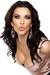
Amanda: Something about this seems eerily familiar... but I still like it. Your skin is great, your hair is awesome, and your eyes are really cute. You do have a little too much eyeshadow on, though, so the focus goes away from your skin somewhat. It's still great. Good work
Janice: I was just thinking the exact same thing: There's something eerily familiar about this picture, and I can't quite put my finger on it. Your skin looks great, but I think the problem here is that your eyes are a bit dead. There doesn't seem to be any life in them. It works well for CoverGirl, but still needs to be a bit more perky.
Rachel: It is the same styling from my mem wall picture lol
Lana: Beautiful styling. I love your skin. You look very fresh and commercial here. I think you could play with your expression more. I love the necklace. Not too much but it helps to inject your personality more in the photo. Overall good job!!!
Zooey: I'm not a big fan of this picture. I see no life in your face and it just looks very awkward for an advertisement. The look is commercial and very CoverGirl, but the expression is just very off-putting and I'd be surprised if the photo was ever used for an actual advertisement. The make-up does a nice job flattering you without taking focus away from the theme given for the round. The styling is nice, too. My problem is just your face this round. You look very unsure of what you're doing or it looks like a Polaroid shot that a casting director would take of a model/actress after meeting.
Morgan: This photo doesnt strike me as the best shot for covergirl. There are too many distractions from your face and what you are supposed to be selling - the foundation. I love your hair but its in the way here, you look uncomfortable and the energy seems to be lacking a little here. You look beautiful as you always do, and your face looks very clean and smooth which emphasizes the foundation. But I dont know if that will be enough this round.
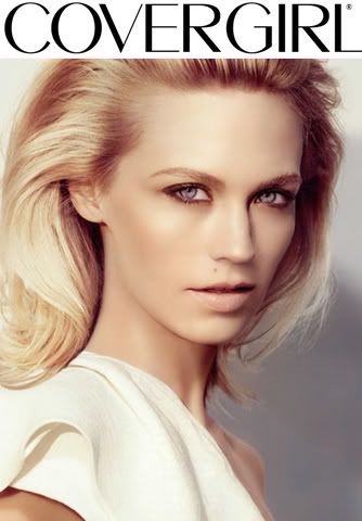
Janice: This could probably work as an advertisement for another brand, but it's not for CoverGirl. Your skin does look flawless, and the coverage is even. Your eyes and lips do stand out, but they're not stealing the spotlight away from your skin. But as I said, not for CoverGirl.
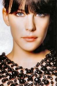
Liv: I'm confused. I'm emphasizing the correct feature to correspond with the product that we're showcasing. It's a shot of me modelling against a plain background, which is what Covergirl shots almost always are. What makes this not Covergirl?
Janice: Well, cover girl has a certain look to it. Covergirl is a simple back ground, simple pose, simple wardrobe, simple styling (Neither Charlize's or my photo last season were suitable for covergirl for that matter too). There's just a bit too much going on in this photo. It is all the cause of the jacket.
Does that make sense?
Liv: Well... given that I specifically chose this photo over others because the outfit didn't draw attention away from the face, and that the winner and runner-up of last season apparently also didn't meet those criteria... not really.
And I'm honestly not trying to be argumentative or anything. I just simply don't see how this photo doesn't meet those criteria. I think the jacket's very understated and doesn't detract focus from the face at all, and I think the rest of the photo overall meets the criteria that you suggested. But that's just my opinion...
Amanda:Amanda: I see "breezy" and I see "beautiful." Seriously THOSE EYES ARE AMAZING. This is really the first time I've taken notice of just how blue those pupils are. My eyes are drawn right to them - and it's not because of makeup. You are showing off the blush well - your face is amazing, and your hair is great too. I personally do see Janice's point, but really, this COULD work for CoverGirl. The background is boring enough and it's definitely good modeling. This is something that goes beyond what CoverGirl is about while still staying true to it. I personally love this. Great work, Liv
Morgan: It is hard for you miss Liv, because you have so many striking features as you said such as your lips and eyes. Like Amanda I am immediately drawn into those beautiful blue eyes and pink lips, but I also notice your clean, smooth, beautifully outlined facial features. This photo combines all your amazing features together well and makes a great shot. I like the edginess to this photo with the jacket and the long wavy hair as well, I think you have pulled this off well.
Lana: I love your beautiful blue eyes in this photo. Your skin looks great but I agree with Janice, the zoom up version look so much better since we can focus to your face directly. I really like the angle but I think your face expression could be better. But overall, you look beautiful. Good job
Zooey: As a picture and as a picture where your skin is supposed to look beautiful, I really like this photo. However, I have to agree with Janice in one area: this doesn't really read CoverGirl to me. This looks a little more high-fashion or possibly a little more artistic, while CoverGirl tends to be very commercial. Other than the brand feeling off, I really like this picture, though.
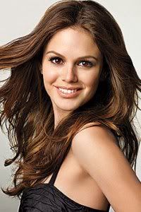
Janice: You look very commercial and relateable. That is great. The coverage on your skin look even and natural. Your hair blowing back shows as much of your face as possible, and the rest of the photo is great. Good job.
Amanda: Very commercial. A bit tan, but very commercial. You look cute and your skin is radiating - I'm drawn to your face, and I love your hair too. This is a very eye-pleasing photograph that doesn't do anything too fancy - that's what CoverGirl is all about. It's good - not the best CoverGirl photo I've ever seen, but it's what we're looking for. Good job
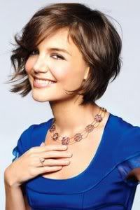
Morgan: Hello easy, breezy, beautiful! As the other judges have mentioned, this looks very commercial and inviting. Your smile is gorgeous, the shape of your face looks amazing and really stands out, and you are definitely selling the foundation by not having much other makeup on. It looks like a natural beauty here which I love.
Lana: Very cute and lovely.. I love the energy that you brought in this photo. The smile is beauty. I love the wind on your hair. Very beautiful, Katie.. Good job!!!
Zooey: Probably the most commercial picture this round and for the task at hand, that's definitely a good thing. Your make-up and accessorizing is nice in this photo and definitely doesn't take away any focus from the product. Very strong showing this round.
Janice: Your skin look flawless here, and your natural beauty just exudes out of the photograph. I like that your hair is pulled back, and yes, the eyes and lips do not steal any focus away. Microminerals Foundation is supposed to be an coverage, and you've pulled that off great.
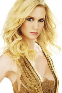
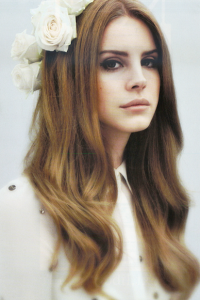
Amanda: Sorry, Jan... I'm not really too fond of this. Your eyes are somewhat droopy and your mouth is a bit odd for me. Your skin is beautiful and flawless and shows the product off well, but this photo is almost depressing to look at because of the eyes and the shadow in the background. So really, you show the product off well. it's just that your eyes really kill the mood. It's not terrible, but it's just... decent. And at the final four, even with your track record, that isn't going to suffice... although I -really- do not want you to leave this round...
Morgan: I actually really like this, your face has great contours and it is really emphasized in this shot. Your beauty mark is gorgeous, your eyes are piercing and your hair has a lot of life and bounce to it rather than it being a straight mess around your shoulders. I think this shot represents the foundation well, as there is not much other makeup taking away from that spotlight. Your lips do look a little droopy and uneven, maybe if you put some more tension in them or closed them a little more it could help, but its a minor quibble. I think you have done a great job!
Lana: Flawless!!! I think you look beautiful here. Your skin looks great and very natural!! I really love your hairstyles.. I'm really impress with this photo. Good job
Zooey: Very nice photo this round. Your skin looks fantastic and while your eyes and lips still look beautiful, they don't steal focus away from the product. This looks like a higher-end commercial photo, but still gives off the CoverGirl vibe.
This CoverGirl shoot asked you to model a discontinued foundation product. Let's do this in reverse-alphabetical order for once!
Amanda: Something about this seems eerily familiar... but I still like it. Your skin is great, your hair is awesome, and your eyes are really cute. You do have a little too much eyeshadow on, though, so the focus goes away from your skin somewhat. It's still great. Good work

Janice: I was just thinking the exact same thing: There's something eerily familiar about this picture, and I can't quite put my finger on it. Your skin looks great, but I think the problem here is that your eyes are a bit dead. There doesn't seem to be any life in them. It works well for CoverGirl, but still needs to be a bit more perky.
Rachel: It is the same styling from my mem wall picture lol
Lana: Beautiful styling. I love your skin. You look very fresh and commercial here. I think you could play with your expression more. I love the necklace. Not too much but it helps to inject your personality more in the photo. Overall good job!!!
Zooey: I'm not a big fan of this picture. I see no life in your face and it just looks very awkward for an advertisement. The look is commercial and very CoverGirl, but the expression is just very off-putting and I'd be surprised if the photo was ever used for an actual advertisement. The make-up does a nice job flattering you without taking focus away from the theme given for the round. The styling is nice, too. My problem is just your face this round. You look very unsure of what you're doing or it looks like a Polaroid shot that a casting director would take of a model/actress after meeting.
Morgan: This photo doesnt strike me as the best shot for covergirl. There are too many distractions from your face and what you are supposed to be selling - the foundation. I love your hair but its in the way here, you look uncomfortable and the energy seems to be lacking a little here. You look beautiful as you always do, and your face looks very clean and smooth which emphasizes the foundation. But I dont know if that will be enough this round.
Janice: This could probably work as an advertisement for another brand, but it's not for CoverGirl. Your skin does look flawless, and the coverage is even. Your eyes and lips do stand out, but they're not stealing the spotlight away from your skin. But as I said, not for CoverGirl.
Liv: I'm confused. I'm emphasizing the correct feature to correspond with the product that we're showcasing. It's a shot of me modelling against a plain background, which is what Covergirl shots almost always are. What makes this not Covergirl?
Janice: Well, cover girl has a certain look to it. Covergirl is a simple back ground, simple pose, simple wardrobe, simple styling (Neither Charlize's or my photo last season were suitable for covergirl for that matter too). There's just a bit too much going on in this photo. It is all the cause of the jacket.
Does that make sense?
Liv: Well... given that I specifically chose this photo over others because the outfit didn't draw attention away from the face, and that the winner and runner-up of last season apparently also didn't meet those criteria... not really.
And I'm honestly not trying to be argumentative or anything. I just simply don't see how this photo doesn't meet those criteria. I think the jacket's very understated and doesn't detract focus from the face at all, and I think the rest of the photo overall meets the criteria that you suggested. But that's just my opinion...
Amanda:Amanda: I see "breezy" and I see "beautiful." Seriously THOSE EYES ARE AMAZING. This is really the first time I've taken notice of just how blue those pupils are. My eyes are drawn right to them - and it's not because of makeup. You are showing off the blush well - your face is amazing, and your hair is great too. I personally do see Janice's point, but really, this COULD work for CoverGirl. The background is boring enough and it's definitely good modeling. This is something that goes beyond what CoverGirl is about while still staying true to it. I personally love this. Great work, Liv

Morgan: It is hard for you miss Liv, because you have so many striking features as you said such as your lips and eyes. Like Amanda I am immediately drawn into those beautiful blue eyes and pink lips, but I also notice your clean, smooth, beautifully outlined facial features. This photo combines all your amazing features together well and makes a great shot. I like the edginess to this photo with the jacket and the long wavy hair as well, I think you have pulled this off well.
Lana: I love your beautiful blue eyes in this photo. Your skin looks great but I agree with Janice, the zoom up version look so much better since we can focus to your face directly. I really like the angle but I think your face expression could be better. But overall, you look beautiful. Good job
Zooey: As a picture and as a picture where your skin is supposed to look beautiful, I really like this photo. However, I have to agree with Janice in one area: this doesn't really read CoverGirl to me. This looks a little more high-fashion or possibly a little more artistic, while CoverGirl tends to be very commercial. Other than the brand feeling off, I really like this picture, though.
Janice: You look very commercial and relateable. That is great. The coverage on your skin look even and natural. Your hair blowing back shows as much of your face as possible, and the rest of the photo is great. Good job.
Amanda: Very commercial. A bit tan, but very commercial. You look cute and your skin is radiating - I'm drawn to your face, and I love your hair too. This is a very eye-pleasing photograph that doesn't do anything too fancy - that's what CoverGirl is all about. It's good - not the best CoverGirl photo I've ever seen, but it's what we're looking for. Good job

Morgan: Hello easy, breezy, beautiful! As the other judges have mentioned, this looks very commercial and inviting. Your smile is gorgeous, the shape of your face looks amazing and really stands out, and you are definitely selling the foundation by not having much other makeup on. It looks like a natural beauty here which I love.
Lana: Very cute and lovely.. I love the energy that you brought in this photo. The smile is beauty. I love the wind on your hair. Very beautiful, Katie.. Good job!!!
Zooey: Probably the most commercial picture this round and for the task at hand, that's definitely a good thing. Your make-up and accessorizing is nice in this photo and definitely doesn't take away any focus from the product. Very strong showing this round.
Janice: Your skin look flawless here, and your natural beauty just exudes out of the photograph. I like that your hair is pulled back, and yes, the eyes and lips do not steal any focus away. Microminerals Foundation is supposed to be an coverage, and you've pulled that off great.
Amanda: Sorry, Jan... I'm not really too fond of this. Your eyes are somewhat droopy and your mouth is a bit odd for me. Your skin is beautiful and flawless and shows the product off well, but this photo is almost depressing to look at because of the eyes and the shadow in the background. So really, you show the product off well. it's just that your eyes really kill the mood. It's not terrible, but it's just... decent. And at the final four, even with your track record, that isn't going to suffice... although I -really- do not want you to leave this round...
Morgan: I actually really like this, your face has great contours and it is really emphasized in this shot. Your beauty mark is gorgeous, your eyes are piercing and your hair has a lot of life and bounce to it rather than it being a straight mess around your shoulders. I think this shot represents the foundation well, as there is not much other makeup taking away from that spotlight. Your lips do look a little droopy and uneven, maybe if you put some more tension in them or closed them a little more it could help, but its a minor quibble. I think you have done a great job!

Lana: Flawless!!! I think you look beautiful here. Your skin looks great and very natural!! I really love your hairstyles.. I'm really impress with this photo. Good job
Zooey: Very nice photo this round. Your skin looks fantastic and while your eyes and lips still look beautiful, they don't steal focus away from the product. This looks like a higher-end commercial photo, but still gives off the CoverGirl vibe.




 Bye Rachel!