Post by Lana Del Ray on Mar 21, 2012 2:52:02 GMT -7
Hello Girls!!!
Welcome to your Fifth Judging Session. This week, you girls were partnered for the first time and let see how you girls did this week
Christina & Dannii - Black & White Natural Beauty Shot

Janice: Beauty shots are HARD to pull off. I don't think you've pull off the shot very well. Your make up is really at fault. Especially since, according to your partner, you were going for a very natural and stripped down black and white beauty shot. Here, instead, it looks like you have a couple of black eyes.
Amanda: I want to like this more than I do. Really - it isn't easy to pull off, and you look a bit lost here. You look like you don't want to pull it off. Your hair also takes away from the contours of your face, which is an important part of a beauty shot - we want to see the lines, the beauty, the flawlessness of your skin. In concept, this is a good risk to take, but you're not pulling it off completely. You're pretty, but you're not beautiful, so it isn't what it could be, sorry :/
Lana: I think you look very soft here. It's nice to see this side of you since you've been giving us the 'fierce' side of Christina before. I love your vulnerability in this photo. But I think you can work on your face expression more.
Morgan: I like seeing this soft natural look of yours, and you still look beautiful minus the makeup. I agree with Amanda that pulling your hair back would have allowed your face to shine through more, which would have made this stronger and more personalised. I can definately see the sisterly aspect between you and Danni so I think you have pulled that off well.
Zooey: There's something about this photo that speaks to me. It sort of has a haunting beauty to it. I actually like your hair in this. It frames your face well and it adds a nice element to the photo; makes it feel a bit more dire, which is the overall impression that I get from this picture. It's a very simple shot, but I guess I like it a bit more on an artistic level than on a modeling level. For a modeling shot, I do see why you're getting a negative reaction in some critiques. I like it for what it is and you definitely have a strong connection to your partner with this shot.

Janice: Beauty shots are very hard to pull off. You pull off the beauty better than Christina, but she's wearing heavy make up - You're not. That's a problem. Your face is really lopsided. Are you sure you didn't have Bell's Palsy at one stage? Or were you just born with that.
Amanda: And Janice, what disease do you have? Constantius Peimesus?
Dannii, Dannii, Dannii... you almost look like a bored, braindead zombie here. Your face is flubby and it doesn't go well with the expression in your eyes. I like how hard you're trying here, but you're not hitting a home run - this is dull, this is forgettable, this is nothing new. I'm not going to remember this as "Wow, this girl is beautiful!" based on a nice natural shot like this. I like your hair and you are pretty, but you're almost about to cry. It's not doing much for me. Sorry
Lana: I think this photo compliment the one that Christina sent really well. I can feel the connection between both photos. But I agree with Janice. The angle of you face could be better. But one thing I like the most about this photo is you look way younger than before.
Morgan: And what disorder do you have Amanda? Wear-less-hats-ius!
You really do look like your going to cry here, but this is a good natural shot of you. You have great bone structure and you look cute here. It does look like your trying to push out your lips, and creating a bit of a fake pout. But when your photo and Christina's photo are put along side one another, I can definitely see the connection and I love that you have pulled that off well.
Zooey: Despite this photo being so similar to Christina's stylistically, I don't find myself liking it as much. Christina's photo had a kind of haunting beauty to it that I feel is missing from this photo. The emotion that you two evoke and the natural and disheveled looks are the same, and I do like how natural it is. It just could have been a bit stronger for me. Both you and Christina did a great job with the theme this week finding pictures that so easily go with one another.
Dianna & Mariah - Laying Down Sisters

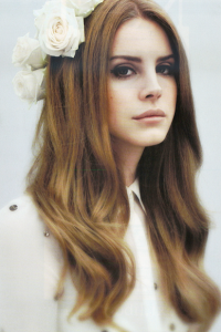
Lana: I love this side of you Dianna. You look very fierce. I love the styling. And those neck!!! Gorgeous. Strong body language. Sexy outfit. I think everything in this photo works perfectly together.
Morgan: Wow, your neck IS really long in this. I love how you are modelling all through this, and the styling looks great too. It would have been better if there was more light on your face to light up your eyes, and if you did something better with your mouth. But overall this is great, I like how you look like the fierce, punk/rock/alternative sister when I put the two photos of you and Mariah together.
Amanda: I don't feel a connection between you and Mariah. Your two photos hardly relate to one another. This is also a bit too much for me. It's just... it doesn't seem like you. I love the neck, but the photo is dark and drab, and you don't have enough energy to brighten it up. Perhaps this is just my own disconnect, but I'm not overly fond of this. :/
Janice: You look fantastic! Just wow! You are modelling A+ This is just amazing! But in connection to Mariah, not as strong as what you had in your other samples. I think it's disappointing.
Zooey: Such a striking shot of you this round. The mood of the photo is very similar to last round, but I'm fine with that because I love this edgy side of you. As a stand-alone photo, this shot is fantastic. However, when put next to Mariah's photo, the connection is weak at best.

Lana: It came across as a little bit hoochie for me. I think the connection between two photo is good. I wish we would get see more of your legs. Overall it was just okay for me.
Amanda: No. I don't feel the connection. I don't feel the energy. I hate the cropping. Your expression is weak. I don't fancy that dress. I do like the hair and your idea, but it just falls flat. This could be more sexy than it is - right now, it's just trying too hard. Sorry :/
Janice: I don't think it's hoochie. It's not at all too overtly sexy in any way. You know, I love the way your face looks here. Top up, it's A+, but your legs, you need to not point them away from the camera, it makes you look like a midget.
Zooey: Umm... looks a bit hoochie. Also, the connection to your partner this round is severely lacking. I like your face in the picture, and while I'm fine with the hand placement, leg placement, and dress, when you add it all up, I believe that's where you're getting the hoochie comments from.
Morgan: How I would love to be that piano.
You look very sexy and sultry in this. I dont find you to be too hoochie here, your pose isnt hoochie but your dress is a little revealing which can give off that hoochie vibe. I like how when I compare your photo with Dianna, you seem to have a lighter, softer photo whilst Dianna has a dark, edgy photo. You are both lying down and bring different elements which I like, but overall the connection isnt as strong as other models have been presenting.
January & Rose - Yin-Yang Sisters
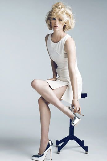
Janice: That you for the little graphic, but I think you should've flipped Rose upside down on it. Then the chair would be the white dot. I love the contrast between you, you're different, but the same. I actually really like both of these. You look timid, Rose looks confident. It flows really well with the Yin Yang. I really love this, good job!
Lana: This photo alone was quite safe. But along with Rose's photo and the Yin-Yang Theme, it worked magnificently together. Very strong connection. Very good job, January!!!
Morgan: Well, well, well who is a clever model. I love this, I love the concept, I love how you look. The connection between you and Rose looks like it was ment to be, I can totally see the Yang in you. This also has a high fashion element that draws me in, and yet you look so innocent at the same time. Good job this round!
Amanda: I find this plain. It doesn't pop out at me. It's very nice-looking, but it isn't memorable. The yin-yang connection is strong, and rather striking. But although you do look great... it just doesn't strike me as "WOW" in any way. Don't get me wrong - you did a marvelous job, it's just... not as amazing as it could be. You're safe, so don't worry!
Zooey: I love the connection between you two this shoot. It's very witty and I definitely have to praise you two for that. As a standalone photo, yeah, this could be a bit on the boring side, but this was meant as a duos shoot and together, your photos compliment each other so well that it's anything but boring. As for you individually, I love the hair, the dress, and I like the pose. The overall styling of the photo works really well for me.
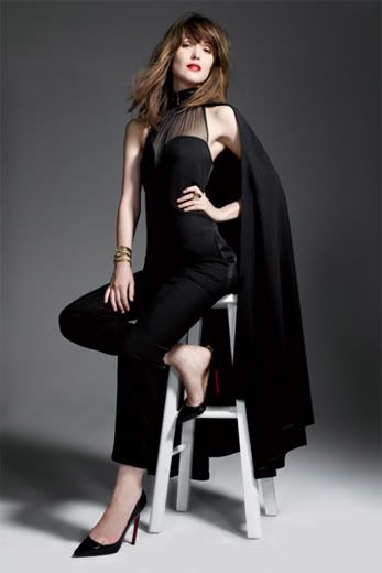
Janice: As I told January, I love the Yin-Yang part of these photos. I really love the whole concept of your shoot. You're different but the same. Just be careful of that angle, you look older.
Lana: Agree with Janice. You look a little bit matured here. But as the whole package, I think both of you worked pretty well together. I saw a lot of good suggestions in your tribe board. And this Yin-Yang theme is one of them. Overall, good job, Rose
Morgan: As the other judges have said, you do look older here but you still have that elegance and look very poised so it's not a problem for me in this photo. I love how you seem to be very in control of your body and modelling every part of you. The yin-yang concept works so well, I'm so impressed by how well these two photos come together. Great job!
Amanda: You look great and matured, and this is a definite improvement from last week. Like I said to January, your connection is really strong and striking - but the photo itself doesn't have the "WOW" factor. It's just kind of plain. Nothing completely pops out at me, but that strong connection and good modeling are enough to get you two to next round, so good work
Zooey: Out of both times this shoot has been done, I feel that this connection is by far the most witty and original connection between two models. The photos compliment each other so well that they do nothing except made each other look better. Your face does look a little aged in this photo, but I really like everything else about the picture.
Katie & Zoe - Sisters with the Same Necklace

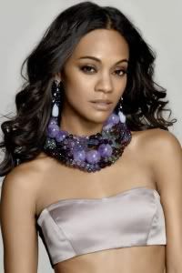
Lana: I love those crazy necklaces. Your styling here is very good. And the shoes!!! Wow!!! I want everything on your body right now!!! I think your face a little bit 'clueless' here. Pretty but I think you can do better with your face.
Amanda: I like the contrast between you and Zoe - yours is darker, hers is lighter, despite similar dresses and the same necklace. I also really love this. It's sexy, it's genuine, and very pleasant to look at - your legs are amazing and I want those shoes! I like the inventive setting and your hair looks great; however, I must agree with Lana - your expression needs a little work. You do a good job, you just don't knock it out of the park. Still, great job
Janice: Did you sabotage Zoe? You had a lot better samples than these two. Ones where SHE actually looked good. You look a lot better than her, and I'm not going to lie. I don't see the connection in any way other than you're wearing the same necklace. Are you wearing the same dress? I don't know honestly. Yours in the stronger one here.
Morgan: As Janice said, your photo is definately more stronger than Zoe's. You really do look great in this, your body posture is very strong, that dress looks like it is painted on you because it fits your curves and your body shape so well. And is that a necklace!? I seriously thought it was a snake. A bit more passion and tension in your face would have topped off this photo.
I dont see a great connection between you and Zoe. A necklace is such a small connection to make between two completely different photos, I would have liked to see more of a sisterly aspect between you both. But I understand you picked something that you both had that was similar, which is what the photoshoot asked you to do.
Zooey: Ok, I can see a connection. It's not the strongest, but I can detect one. The necklaces and color palette of the dresses help, but just the general cohesive vibe of the pictures is lacking. You do outshine Zoe in this shoot as it's a really good shot of you. I'm just disappointed the theme wasn't better represented.

Lana: Good job for finding the same or almost similar necklace as Katie. I'm glad that you picked this photo instead of the other one. I think your pose look great. Your energy here is great. My only issue is the lighting on the right of this photo. Too bright. Other than that good job
Amanda: Your photo contrasts that of Katie's despite the similar garb and jewelry. Yours is bright and striking - though not to the same extent as your Dreamland photo - and I enjoy your energy and the pose and pretty much everything. I must agree about the lighting on the left side though - it's a bit too bright and it distracts from you somewhat. Just a little toning down would help. This is still quite good and a major improvement over your last two rounds, so good work
Janice: I think you could've done a lot better than this, and you know it. I think you chose the worst photo/matching you could have for this shoot. I can only tell that you're wearing the same necklace. Are you wearing the same dress? I don't know, yours is cut off. Your face. You're still looking like an old lady. You need to listen to what I say to you.
Morgan: You do look a little weathered here. Your face looks tight and the smile looks forced. This is a bit too posey for me, compared to Katies photo which seemed a bit more natural and relaxed. I think the only part of you that seems relaxed is the arm above your head, you have control of that arm and yet you are also being graceful at the same time and I think thats something you need to incorporate into your overall modelling.
The connection you have between your photo isnt too strong for me, but I am now noticing that the dress you have on is similar to Katies and similar necklaces. But I think that they are minor details to match each other with. Something stronger would have been better
Zooey: I want the Zoe from the beginning of the competition back. If you survive this week, promise me you'll be back on top of your game. While the pose is nice, your face is definitely weathered. It's not your best angle... especially with the harsh light. The connection between you and your partner was there this week, but it wasn't strong. As I said to Katie, the vibe I get from your picture is completely different than the vibe I get from Katie's picture. Other than the same necklace and a similar dress color, the pictures have no correlation with one another.
Liv & Rachel - Sisters with Similar Pose & Setting

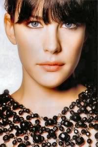
Janice: It's really hard to see your face, Liv. You have really long legs, and I love the way you're showing off those bracelets. But that bag you're wearing makes it look like your boobs are old and saggy.
Lana: Beautiful legs. I think the pose is strong. I love the combination of the styling. Unlike Janice, I love the dress. Overall it's a good photo but I'm not sure if this is memorable enough.
Morgan: I like the similarity between you and Rachel, you both are wearing similar dresses, and have similar poses. But this photo of you looks a bit messy. Your hair is taking away the attraction from your face and the dress isnt doing wonders for your upper half of your figure. However you have a great long neck here and gorgeous legs. You pulled off the sisterly connection well
Amanda: The connection between you two is strong here, and both of you are very sexy. Your legs here are delicious and you're definitely modeling that dress, although I find it a bit too baggy. I don't hate it. The bracelets help and your hair is awesome, but it does hide your eyes a little. Still, this is sexy without being trashy, so you did a good job!
Zooey: There's definitely a good connection between you and your partner this round. You're both able to give us similar shots, but there's still a bit of uniqueness to them, too. Your photo is definitely classier than Rachel's and she took a bit more of a risk submitting the photo she did. I love your look and your pose this week and coupled with a good connection with your partner, I feel you've done really well this week.

Janice: The difference between yours and Liv's photo is you look sweaty and Liv doesn't. Liv is shyly covering up her cootch, you look like you're fingering yourself. You both have really long legs though, I can see the similarity between the two. I really like that angle of your face on you though. It's a risky angle, and you've pulled it off well.
Lana: The body language is really good. It felt so natural. I think overall both photos worked well together. If we put the photos side by side, I think it looks much better. Overall good photo, Rachel. And Janice, what's wrong with fingering ourself?
Morgan: Rachel! You really do like touching yourself dont you. You actually look quite tall here in my opinion for someone who isnt actually that tall. Your legs look long and the shoes help to give the appearance of your legs being longer than what you are. The way you are stretching your neck and face up is giving you extra length as well. It would be good to see some more of your eyes, it looks like one is slightly open and the other is a black eye. But thats just a minor complaint. I can definately see the connection between you and Liv, you look like the older sister who wants to show Liv up by giving us some extra action.
And Janice, I have no problem with fingering. On or off set, or even in the judging panel.
Amanda. H. O. T. This is sexy. I don't care if you're fingering, as long as you do a good job modeling, and you do. Maybe you have a Hidden Immunity Idol in there? xD
Despite the sexual undertones, you pull it off well. You and Liv are directly connected, and you both look great. Your legs and pose here make you look a lot taller than you are, and the dress is fabulous. I love your hair and your passion. This is awesome - great work
Zooey: Am I the only one finding the sweaty legs to be gross? Ok, good job on taking a risk this week; I generally like and encourage risk-taking. The connection to your partner is strong this week, so I'm happy you did well with the theme.
Welcome to your Fifth Judging Session. This week, you girls were partnered for the first time and let see how you girls did this week
Christina & Dannii - Black & White Natural Beauty Shot

Janice: Beauty shots are HARD to pull off. I don't think you've pull off the shot very well. Your make up is really at fault. Especially since, according to your partner, you were going for a very natural and stripped down black and white beauty shot. Here, instead, it looks like you have a couple of black eyes.
Amanda: I want to like this more than I do. Really - it isn't easy to pull off, and you look a bit lost here. You look like you don't want to pull it off. Your hair also takes away from the contours of your face, which is an important part of a beauty shot - we want to see the lines, the beauty, the flawlessness of your skin. In concept, this is a good risk to take, but you're not pulling it off completely. You're pretty, but you're not beautiful, so it isn't what it could be, sorry :/
Lana: I think you look very soft here. It's nice to see this side of you since you've been giving us the 'fierce' side of Christina before. I love your vulnerability in this photo. But I think you can work on your face expression more.
Morgan: I like seeing this soft natural look of yours, and you still look beautiful minus the makeup. I agree with Amanda that pulling your hair back would have allowed your face to shine through more, which would have made this stronger and more personalised. I can definately see the sisterly aspect between you and Danni so I think you have pulled that off well.
Zooey: There's something about this photo that speaks to me. It sort of has a haunting beauty to it. I actually like your hair in this. It frames your face well and it adds a nice element to the photo; makes it feel a bit more dire, which is the overall impression that I get from this picture. It's a very simple shot, but I guess I like it a bit more on an artistic level than on a modeling level. For a modeling shot, I do see why you're getting a negative reaction in some critiques. I like it for what it is and you definitely have a strong connection to your partner with this shot.

Janice: Beauty shots are very hard to pull off. You pull off the beauty better than Christina, but she's wearing heavy make up - You're not. That's a problem. Your face is really lopsided. Are you sure you didn't have Bell's Palsy at one stage? Or were you just born with that.
Amanda: And Janice, what disease do you have? Constantius Peimesus?
Dannii, Dannii, Dannii... you almost look like a bored, braindead zombie here. Your face is flubby and it doesn't go well with the expression in your eyes. I like how hard you're trying here, but you're not hitting a home run - this is dull, this is forgettable, this is nothing new. I'm not going to remember this as "Wow, this girl is beautiful!" based on a nice natural shot like this. I like your hair and you are pretty, but you're almost about to cry. It's not doing much for me. Sorry

Lana: I think this photo compliment the one that Christina sent really well. I can feel the connection between both photos. But I agree with Janice. The angle of you face could be better. But one thing I like the most about this photo is you look way younger than before.
Morgan: And what disorder do you have Amanda? Wear-less-hats-ius!
You really do look like your going to cry here, but this is a good natural shot of you. You have great bone structure and you look cute here. It does look like your trying to push out your lips, and creating a bit of a fake pout. But when your photo and Christina's photo are put along side one another, I can definitely see the connection and I love that you have pulled that off well.
Zooey: Despite this photo being so similar to Christina's stylistically, I don't find myself liking it as much. Christina's photo had a kind of haunting beauty to it that I feel is missing from this photo. The emotion that you two evoke and the natural and disheveled looks are the same, and I do like how natural it is. It just could have been a bit stronger for me. Both you and Christina did a great job with the theme this week finding pictures that so easily go with one another.
Dianna & Mariah - Laying Down Sisters

Lana: I love this side of you Dianna. You look very fierce. I love the styling. And those neck!!! Gorgeous. Strong body language. Sexy outfit. I think everything in this photo works perfectly together.
Morgan: Wow, your neck IS really long in this. I love how you are modelling all through this, and the styling looks great too. It would have been better if there was more light on your face to light up your eyes, and if you did something better with your mouth. But overall this is great, I like how you look like the fierce, punk/rock/alternative sister when I put the two photos of you and Mariah together.
Amanda: I don't feel a connection between you and Mariah. Your two photos hardly relate to one another. This is also a bit too much for me. It's just... it doesn't seem like you. I love the neck, but the photo is dark and drab, and you don't have enough energy to brighten it up. Perhaps this is just my own disconnect, but I'm not overly fond of this. :/
Janice: You look fantastic! Just wow! You are modelling A+ This is just amazing! But in connection to Mariah, not as strong as what you had in your other samples. I think it's disappointing.
Zooey: Such a striking shot of you this round. The mood of the photo is very similar to last round, but I'm fine with that because I love this edgy side of you. As a stand-alone photo, this shot is fantastic. However, when put next to Mariah's photo, the connection is weak at best.

Lana: It came across as a little bit hoochie for me. I think the connection between two photo is good. I wish we would get see more of your legs. Overall it was just okay for me.
Amanda: No. I don't feel the connection. I don't feel the energy. I hate the cropping. Your expression is weak. I don't fancy that dress. I do like the hair and your idea, but it just falls flat. This could be more sexy than it is - right now, it's just trying too hard. Sorry :/
Janice: I don't think it's hoochie. It's not at all too overtly sexy in any way. You know, I love the way your face looks here. Top up, it's A+, but your legs, you need to not point them away from the camera, it makes you look like a midget.
Zooey: Umm... looks a bit hoochie. Also, the connection to your partner this round is severely lacking. I like your face in the picture, and while I'm fine with the hand placement, leg placement, and dress, when you add it all up, I believe that's where you're getting the hoochie comments from.
Morgan: How I would love to be that piano.
You look very sexy and sultry in this. I dont find you to be too hoochie here, your pose isnt hoochie but your dress is a little revealing which can give off that hoochie vibe. I like how when I compare your photo with Dianna, you seem to have a lighter, softer photo whilst Dianna has a dark, edgy photo. You are both lying down and bring different elements which I like, but overall the connection isnt as strong as other models have been presenting.
January & Rose - Yin-Yang Sisters

Janice: That you for the little graphic, but I think you should've flipped Rose upside down on it. Then the chair would be the white dot. I love the contrast between you, you're different, but the same. I actually really like both of these. You look timid, Rose looks confident. It flows really well with the Yin Yang. I really love this, good job!
Lana: This photo alone was quite safe. But along with Rose's photo and the Yin-Yang Theme, it worked magnificently together. Very strong connection. Very good job, January!!!
Morgan: Well, well, well who is a clever model. I love this, I love the concept, I love how you look. The connection between you and Rose looks like it was ment to be, I can totally see the Yang in you. This also has a high fashion element that draws me in, and yet you look so innocent at the same time. Good job this round!
Amanda: I find this plain. It doesn't pop out at me. It's very nice-looking, but it isn't memorable. The yin-yang connection is strong, and rather striking. But although you do look great... it just doesn't strike me as "WOW" in any way. Don't get me wrong - you did a marvelous job, it's just... not as amazing as it could be. You're safe, so don't worry!

Zooey: I love the connection between you two this shoot. It's very witty and I definitely have to praise you two for that. As a standalone photo, yeah, this could be a bit on the boring side, but this was meant as a duos shoot and together, your photos compliment each other so well that it's anything but boring. As for you individually, I love the hair, the dress, and I like the pose. The overall styling of the photo works really well for me.

Janice: As I told January, I love the Yin-Yang part of these photos. I really love the whole concept of your shoot. You're different but the same. Just be careful of that angle, you look older.
Lana: Agree with Janice. You look a little bit matured here. But as the whole package, I think both of you worked pretty well together. I saw a lot of good suggestions in your tribe board. And this Yin-Yang theme is one of them. Overall, good job, Rose
Morgan: As the other judges have said, you do look older here but you still have that elegance and look very poised so it's not a problem for me in this photo. I love how you seem to be very in control of your body and modelling every part of you. The yin-yang concept works so well, I'm so impressed by how well these two photos come together. Great job!
Amanda: You look great and matured, and this is a definite improvement from last week. Like I said to January, your connection is really strong and striking - but the photo itself doesn't have the "WOW" factor. It's just kind of plain. Nothing completely pops out at me, but that strong connection and good modeling are enough to get you two to next round, so good work

Zooey: Out of both times this shoot has been done, I feel that this connection is by far the most witty and original connection between two models. The photos compliment each other so well that they do nothing except made each other look better. Your face does look a little aged in this photo, but I really like everything else about the picture.
Katie & Zoe - Sisters with the Same Necklace

Lana: I love those crazy necklaces. Your styling here is very good. And the shoes!!! Wow!!! I want everything on your body right now!!! I think your face a little bit 'clueless' here. Pretty but I think you can do better with your face.
Amanda: I like the contrast between you and Zoe - yours is darker, hers is lighter, despite similar dresses and the same necklace. I also really love this. It's sexy, it's genuine, and very pleasant to look at - your legs are amazing and I want those shoes! I like the inventive setting and your hair looks great; however, I must agree with Lana - your expression needs a little work. You do a good job, you just don't knock it out of the park. Still, great job

Janice: Did you sabotage Zoe? You had a lot better samples than these two. Ones where SHE actually looked good. You look a lot better than her, and I'm not going to lie. I don't see the connection in any way other than you're wearing the same necklace. Are you wearing the same dress? I don't know honestly. Yours in the stronger one here.
Morgan: As Janice said, your photo is definately more stronger than Zoe's. You really do look great in this, your body posture is very strong, that dress looks like it is painted on you because it fits your curves and your body shape so well. And is that a necklace!? I seriously thought it was a snake. A bit more passion and tension in your face would have topped off this photo.
I dont see a great connection between you and Zoe. A necklace is such a small connection to make between two completely different photos, I would have liked to see more of a sisterly aspect between you both. But I understand you picked something that you both had that was similar, which is what the photoshoot asked you to do.
Zooey: Ok, I can see a connection. It's not the strongest, but I can detect one. The necklaces and color palette of the dresses help, but just the general cohesive vibe of the pictures is lacking. You do outshine Zoe in this shoot as it's a really good shot of you. I'm just disappointed the theme wasn't better represented.

Lana: Good job for finding the same or almost similar necklace as Katie. I'm glad that you picked this photo instead of the other one. I think your pose look great. Your energy here is great. My only issue is the lighting on the right of this photo. Too bright. Other than that good job
Amanda: Your photo contrasts that of Katie's despite the similar garb and jewelry. Yours is bright and striking - though not to the same extent as your Dreamland photo - and I enjoy your energy and the pose and pretty much everything. I must agree about the lighting on the left side though - it's a bit too bright and it distracts from you somewhat. Just a little toning down would help. This is still quite good and a major improvement over your last two rounds, so good work

Janice: I think you could've done a lot better than this, and you know it. I think you chose the worst photo/matching you could have for this shoot. I can only tell that you're wearing the same necklace. Are you wearing the same dress? I don't know, yours is cut off. Your face. You're still looking like an old lady. You need to listen to what I say to you.
Morgan: You do look a little weathered here. Your face looks tight and the smile looks forced. This is a bit too posey for me, compared to Katies photo which seemed a bit more natural and relaxed. I think the only part of you that seems relaxed is the arm above your head, you have control of that arm and yet you are also being graceful at the same time and I think thats something you need to incorporate into your overall modelling.
The connection you have between your photo isnt too strong for me, but I am now noticing that the dress you have on is similar to Katies and similar necklaces. But I think that they are minor details to match each other with. Something stronger would have been better
Zooey: I want the Zoe from the beginning of the competition back. If you survive this week, promise me you'll be back on top of your game. While the pose is nice, your face is definitely weathered. It's not your best angle... especially with the harsh light. The connection between you and your partner was there this week, but it wasn't strong. As I said to Katie, the vibe I get from your picture is completely different than the vibe I get from Katie's picture. Other than the same necklace and a similar dress color, the pictures have no correlation with one another.
Liv & Rachel - Sisters with Similar Pose & Setting

Janice: It's really hard to see your face, Liv. You have really long legs, and I love the way you're showing off those bracelets. But that bag you're wearing makes it look like your boobs are old and saggy.
Lana: Beautiful legs. I think the pose is strong. I love the combination of the styling. Unlike Janice, I love the dress. Overall it's a good photo but I'm not sure if this is memorable enough.
Morgan: I like the similarity between you and Rachel, you both are wearing similar dresses, and have similar poses. But this photo of you looks a bit messy. Your hair is taking away the attraction from your face and the dress isnt doing wonders for your upper half of your figure. However you have a great long neck here and gorgeous legs. You pulled off the sisterly connection well

Amanda: The connection between you two is strong here, and both of you are very sexy. Your legs here are delicious and you're definitely modeling that dress, although I find it a bit too baggy. I don't hate it. The bracelets help and your hair is awesome, but it does hide your eyes a little. Still, this is sexy without being trashy, so you did a good job!

Zooey: There's definitely a good connection between you and your partner this round. You're both able to give us similar shots, but there's still a bit of uniqueness to them, too. Your photo is definitely classier than Rachel's and she took a bit more of a risk submitting the photo she did. I love your look and your pose this week and coupled with a good connection with your partner, I feel you've done really well this week.

Janice: The difference between yours and Liv's photo is you look sweaty and Liv doesn't. Liv is shyly covering up her cootch, you look like you're fingering yourself. You both have really long legs though, I can see the similarity between the two. I really like that angle of your face on you though. It's a risky angle, and you've pulled it off well.
Lana: The body language is really good. It felt so natural. I think overall both photos worked well together. If we put the photos side by side, I think it looks much better. Overall good photo, Rachel. And Janice, what's wrong with fingering ourself?
Morgan: Rachel! You really do like touching yourself dont you. You actually look quite tall here in my opinion for someone who isnt actually that tall. Your legs look long and the shoes help to give the appearance of your legs being longer than what you are. The way you are stretching your neck and face up is giving you extra length as well. It would be good to see some more of your eyes, it looks like one is slightly open and the other is a black eye. But thats just a minor complaint. I can definately see the connection between you and Liv, you look like the older sister who wants to show Liv up by giving us some extra action.
And Janice, I have no problem with fingering. On or off set, or even in the judging panel.
Amanda. H. O. T. This is sexy. I don't care if you're fingering, as long as you do a good job modeling, and you do. Maybe you have a Hidden Immunity Idol in there? xD
Despite the sexual undertones, you pull it off well. You and Liv are directly connected, and you both look great. Your legs and pose here make you look a lot taller than you are, and the dress is fabulous. I love your hair and your passion. This is awesome - great work

Zooey: Am I the only one finding the sweaty legs to be gross? Ok, good job on taking a risk this week; I generally like and encourage risk-taking. The connection to your partner is strong this week, so I'm happy you did well with the theme.

