Post by Lana Del Ray on Mar 14, 2012 8:08:35 GMT -7
Hello Girls!!!
This week, you need to submit not one but two photos to represent both sides of Commercial & High Fashion.
Let's see your photos now

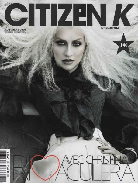
Janice: What you have here is one great high fashion magazine cover, and one so-so high fashion magazine cover. You being an extremely popular pop singer, I would have thought you'd have more to offer in commercial magazine covers than what you posted. As I said, that's a second high fashion photo, not a commercial photo. Your high fashion magazine cover is amazing though.
Amanda: Now THIS is what I was waiting for. That Citizen K cover is marvelous. I like the way it's almost grayscaled, yet seems to have a little extra colorization. Your expression is AMAZING. Your hair looks a bit... too elderly, but really, it works with the cover. I really like it.
But I'm with Janice on the other one. It's somewhat more high-fashion than commercial, and it doesn't pop out at me in any way. It's plain, but your high-fashion cover will definitely be enough to dominate this week. Great job on that one
Lana: OMG!!! I love your HF one. Bold, Dark and stunning!!! The styling is very haunting and I felt the emotion that you gave us in this photo. On the other hand, your commercial one was a little bit week. There's nothing memorable about it
Morgan: I completely agree with the other judges, your high fashion magazine cover is amazing! You look so fierce, and your face has all the right tension in it. Your hair is crazy in a positive sense, I am just blown away by how well you pulled off that shot. I think your commercial cover is cute and sexy, you look like a hoochie, fashionable barbie but as the other judges said its not memorable and doesn't stand out. Your high fashion magazine set the mark too high and your commercial cover just doesn't compare.
Zooey: The high fashion cover is great. I'm so happy to see it from you since you didn't fair too well the first two weeks. It shows that you're here and you can be a legitimate threat in this competition. I don't have a single negative thing to say about your high fashion cover.
I'm not a fan of your commercial one, though. Mainly because it's not really that commercial.


Amanda: I'm not completely fond of either one of these, and I'm not sure why. Maybe it's only because they fail to wow me. Maybe because it's again that you look older. They're not as bad as last round - but still...
The commercial cover is okay, just nothing special. I like your smile. I like your eyes. I like your necklace. But there isn't much of anything unique. There's nothing that pushes the envelope for me. It's not as much of a risk as it could be, and after last round, I was hoping you'd deliver for us.
The high-fashion one has the issue with your eyes - the makeup seems overdone given the angle, and your expression makes you look almost constipated. I also don't like your outfit here - it's too dark. It's too dull. Nothing makes it "pop" for me.
In the end, these are both okay. They are better than last round, but they aren't anything spectacular.
Janice: I completely disagree with Amanda. Both of these magazine covers a great in my opinion. In your commercial, your eyes and smile pop. And you fill in the commercial criteria well. People would buy this magazine. Your high fashion one is something new, and risky. Again that risky angle, and it's an angle that works for you. It's something dark and dangerous. I like it.
Lana: I really like your High Fashion cover. I think you look so strong and confident. I'm not so sure with your Commercial cover. I think it was badly cropped, we didn't even get to see the magazine title completely. But you do look beautiful in it.
Morgan: I dont particularly like your commercial cover, your smile looks very forced and I dont see much energy in this shot. Your hairstyle looks a bit dated to me also (I've witnessed many generations of womens hair styling). Your necklace and what seems to look like a cute top, stand out to me more in this than you do. I do like your high fashion shot, your hairstyle doesn't look dated there it fits into the context. Your cheekbones look amazing and the light is hitting your face in all the right ways although your eyes do look too heavily covered in makeup. You can pull off leather well miss Danni!
Zooey: Your smile is very unnatural in the commercial cover. You look like you didn't want to be there and your agent (who will be fired soon afterward) set up the shoot without your knowledge or consent. I love your necklace, though
I do like your high fashion cover, though. You have such a strong face in it and that's a wonderful pose to go along with it. If I had one thing to say negative about it, I guess I'd say I wish your mouth was completely shut rather than seeing a couple teeth. But that's a minor squabble and I'm fine with how the mouth is.


Lana: For you HF shoot, my eyes goes straight to the description. Why does the photo related to Twilight and stuff like that. But you do look gorgeous in this photo. I'm not sure about the placing of V logo. As for your commercial. I like the fact that you look fresh and beautiful. Very sweet
Amanda: I'm guessing you tried to pull a Taylor and make your own V cover, but it doesn't look that special. It doesn't have the same effects that Taylor's did - the black and white and the striking nature of it that still resonate with me to this day. The Twilight reference also greatly confuses me, since you're in Glee and, well, there's no beau there. The description is also a bit too large - it does overshadow you, and a striking black and white effect could have helped it. You do look great and fierce, but the V logo through your neck like that is a bit off-putting, and again, that effect could have helped.
The commercial one is genuine, but boring. There's also the problem that the title is plastered over your forehead and your white top blends into the white background. You're almost in camouflage here, and I'm not going to remember this because you don't stand out. You're almost an afterthought here, even if you do look good. If the title had been more proximal, the text wasn't so overwhelming, and the background had more contrast with your top, this could have been fantastic. Instead, I'm writing this and hardly remembering YOU. Which is :/
Morgan: Both of these covers aren't entirely working for me. Your high fashion shot doesn't have anything unique to me that makes me gasp and think "how did she pull that off and look this stunning." The only unique aspect to this cover is your hair (which isn't that unique when I think off all the wacky hairstyles teenagers are pulling off these days). You look kind of disgusted at something in this shot, and the way the V comes up the right side of your face gives you a black line that distorts your right eye a little bit, making your eye look droopy or looks like your make up has ran.
Your commercial shot is cute, you look beautiful and innocent. But the way the text is plastered all over you, you seem to get upstaged by all the advertising . However your eyes look very strong in this shot , you have a little bit of smizing (yeah im down with the lingo) going on here which makes them stand out well.
Janice: I don't know, I kind of like the angle on your high fashion one, and the ways your eyes look there. One thing that's interesting about these photo is that it's the same angle of your face, but you look completely different in both.
Zooey: I'm sorry, but I don't read high fashion from your high fashion shot. I do appreciate the effort, but it's not a dramatic enough shot and the text is also distracting.
I do like your commercial shot better. You look beautiful in both, but I like the softness you exude in the commercial shot. It makes you feel more approachable.


Amanda: I do not like your high-fashion cover that much. Your hair is... interesting, unique, and high-fashion, but only somewhat to my taste. What really hurts is the lighting on your face - you're almost concealed, and the darkness here isn't doing you any favors. The pose is okay, albeit a bit uncomfortable-looking, and I can't really make much of the outfit. I don't like it... but I don't loathe it.
Your commercial cover is really good in my eyes. Your face is energetic and bright, and your hair really makes this pop. I love the earrings even if I'm not totally sold on the dress. It's a very aesthetically pleasing cover to look at, so good work on this one!
Janice: I'm opposite of Amanda here. For me, your high fashion one is spectacular! That lighting really hits your cheekbones in a different angle. One that we're not used to, and it creates the perfect shadows over your face. It's your commercial cover that's my problem. There's not really much energy. It's just a blank smile. You need to do what Tyra does and smile with your eyes as well (But not like her, because she looks constipated sometimes).
Lana: I love your High Fashion cover. And the contrast between these two photos was amazing. I love the styling for both photos. Even though your Commercial one is a little bit boring and safe, but overall, I think you did great job this week
Morgan: I've looked at these magazine covers a few times and I'm beginning to warm up to your high fashion shot more than your commercial shot, you do look unique and have a distinct style about you in this photo. Your commercial shot is cute, and you look appealing. However in both of these shots I'm not seeing anything memorable in them. Your eyes look dead and lifeless in both of the covers, I dont see much energy shining through which I find hard to look past. However your high fashion cover has got a lot of strength in it, and it upstages the commercial cover.
Zooey: I'm fine with your high fashion cover. It's not my favorite, but at least I don't hate it. That hair is definitely unique and interesting. It makes be think of Princess Leia with bedhead. The shading works to your advantage in this photo. I guess I'd have to say I'm really fond of the picture from the neck up. I guess it's mainly that dress that bothers me. I don't feel it's dramatic enough and it actually brings down the dramatic effect of the whole picture, in my eyes.
Your commercial cover is definitely very commercial. You have a nice smile and the pose is just a little playful, which is a nice added touch. I do have to agree with Lana that it is a bit safe, though.
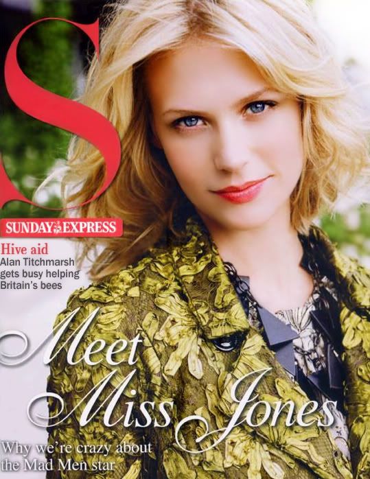
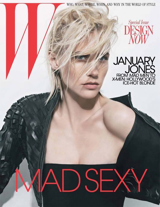
Amanda: Your high fashion cover is just... no. You look like a zombie. Your eyes are terrible, and the way that your hair accentuates it makes you look somewhat ill. I like your outfit, but... you seem like you really don't want to be there, getting photographed for a magazine. I do like the simplicity of the cover, but that just makes your eyes stand out more when... they don't look right to me.
Your commercial cover is a lot better. It's a sweet, genuine photo with a nice outfit... that's almost high-fashion, but not. Don't worry - it's not as bad as Gwen's, partly because it works with the cover, and we can't see all of it. It's not an eyesore. This cover is good, but it isn't my favorite ever by any means.
Janice: Well January, playing these you knew at least one judge would love these didn't you? Your high fashion magazine: Beautiful! Those your hair covers a lot of your face, your eyes really pop out! Not to mention those cheekbones and your contorted pose! You're going from head to toe! As for your commercial, yes, it is young and fresh, but there's also no intensity. It just looks like a pretty girl staring at the camera.
Lana: Well Janice, you might want to change your statement to "at least TWO judges would love these.." I really love it. You look strong, weird but gorgeous. I'm totally love your photo this week. The Commercial one was okay. You look sweet and beautiful. Nothing spectacular but your HF one is going to help you a lot this week.
Zooey: I love your high fashion cover. The way your hair covers your face, yet we can still easily see you is a fantastic touch. Oh, and this may not really be a secret, but I like my rocker chics and you definitely look like a high fashion rocker in this shot. It's my favorite shot of you so far in the competition.
I like your commercial shot, too. Your high fashion is definitely the better shot, but I like the commercial shot is different from what I'm used to seeing, but still commercial. The softness of the makeup and the lightness of the pose helps keep it in the commercial territory.
Morgan: I like both of your covers, but I would have to say I like your commercial cover more. You look so flawless! There doesn't need to be anything extra that stands out because you and your natural beauty does all the standing out. You look like your going to break into a smile, so your expression is adorable to me. I think the only thing that can be improved would be to incorporate some modelling into your posing. Your high fashion shot is also powerful with your hair, in-tenseness in your face and the contorted pose going on in your right arm. But it doesn't seem as powerful as what I would like a high fashion shot to be. But overall you have pulled off both covers well


Amanda: I'm noting that both of these are lower-quality images that seem to have been enlarged. Give your portfolio, however, that's acceptable.
Your commercial cover is something unique, and i do like your hair and face quite a bit. The lighting is a bit awkward, but not enough to detract from you. There's little else to comment on - it's a good cover, it just isn't great.
Your high-fashion cover... are you feeling okay? It may be the effect, but you look pale. The grainy quality is also really bad. I just don't like how this cover was put together. Your shirt is also boring... there's nothing I really like about this cover. I'm neutral toward a lot of it, but it almost looks like a relic from 1978, which is... not a good thing :/
Janice: Your commercial cover is just pretty. It's like "Hello, I'm Hilary Duff." It's boring. And are you on drugs? It looks like it in your high fashion cover. I'd say it's borderline high fashion, but it's not there.
Lana: I think your Commercial photo is quite good. You look serene and soft even though the make up is too bold. As for you HF, I like the vintage element but I'm not so sure if it's working really well in this photo
Morgan: Wow you really do look like Hilary Duff in your commercial cover! You look cute in this and you stand out from the cover which is a good thing. Your face has captured the light well, but there is too much make up on your eyes which steals the attention away from your natural beauty. Your high fashion shot isn't working for me at all, sorry. You seem sleepy and look like you have no energy at all. Other than your earrings and your risky modelling there is nothing that stands out to me in this cover. You really do have a beautiful face, try less makeup and more power from within to really make yourself shine!
Zooey: Ok, unlike several other models this week, your commercial shot is definitely the stronger of the two, for me. It's more of an edgy commercial look, in my eyes. Whatever image quality problems you had this week, it's not that noticeable in the commercial shot. It's very noticeable in the high fashion, though. And I don't really see much that's high fashion about your high fashion sorry. Sorry girl


Lana: I love both photos girl. The styling for both photos is different and gorgeous. I think your look is more commercial but you manage to make yourself edgier in your HF shoot. Thanks to the stylist. My only concern is your neck!!! I swear I really want to cut those collar.
Janice: As Lana said, you're not extending yourself very much in your high fashion cover. In your commercial cover, you are extending the neck. You need to be more consistent in your modelling.
Amanda: I'm not sure on how your commercial cover is cropped, but after that it's great. You stand out even with the "Marie Claire" tattooed onto your head. That smile is great. The styling and everything goes together quite well. I'm going to notice this one simply because it's well-done.
The high-fashion one is great too. You look badass, although I do not like the way your neck is completely obscured, which looks unnatural. That's really my only gripe about it - the styling is good and your eyes are awesome. I really like this, though, so great work
Morgan: I LOVE your high fashion shot! Your face has so much life, your cheekbones stand out, your eyes are wide and beautiful and your lips have just the right amount of tension in them. You seem to have a edgy look going on here and I really enjoy it. Even your hand looks like its modelling.
Your commercial shot is cute, you look really beautiful. Your neck looks so long and you have a great smile. Your left arm is missing which gives it a bit of an amputee look, but your face and lengthy neck stand out so much that its not that noticeable.
Zooey: I really like your high fashion shot. Don't let Lana cut your collar. Pop your collar, girl. The makeup's done well and makes your eyes dramatic. I love the lines along your cheekbone, too.
The commercial cover being from the same shoot as your avatar doesn't matter. You didn't get to choose your avatar, so we're not going to take away a potentially great photo of you. Overall, this photo's very nice. You're styled well and it's interesting, while still being commercial. Your left eye (our right) does look a bit droopy to me, but it's not that bad.


Janice: You have done what many people have failed to do in your commercial: Show intensity in your eyes. There is a genuine smile there, and it's definitely not forced: Your eyes are showing it. I love the angle of your face in your high fashion, but that's it. You need to take it to the next level.
Amanda: Your commercial one is GREAT. The effect works, and your hair is FABULOUS. Your eyes, your smile... everything goes together so well. I really like it.
Your high-fashion one is good, but... it doesn't pop out at me. I want to see more of you! What high-fashion are you showing off here? You have a VERY intense expression, and the angle is wonderful, but like Janice, I am thirsting for more.
Lana: I love both photos. I think you really step up your game this week. I love the contrast between both photos. My only issue with both photos is the styling. A little bit safe but overall you did such a great job for both photos
Morgan: I loveee your commercial shot! You look like your genuninely having a good time. There is strength and energy from your eyes, lips, face, hair and your pose. And because you look like your having fun, you look so adorable. I want to buy this magazine after seeing this cover.
Your high fashion magazine doesn't appeal to me as much, but I still think it is great. Your face here is the main strong point. Your face seems to be oddly shaped in this photo but it works for you really well. Your eyes are peircing and strong. I would have liked to see more of you and the clothes you were wearing, but overall these are both great shots.
Zooey: High praises are definitely in order for your Commercial cover. That one in fantastic. I love your energy and I love the styling. I wish it was in color, but that's a very minor concern of mine cause the photo is just great.
I think your high fashion photo is fine. It's nothing spectacular, but you already know that judging from your description. It's another picture that's almost there in terms of theme, but just needs that extra little push to really fully be there.


Lana: I love the HF one. I think the quality could be better but for the first time in this cycle, I saw as a model, not a celebrity. Your commercial photo was just okay for me. I'm not sure of the angle, your pose doesn't look really natural. But I like your HF one and it will definitely help you this week.
Janice: Well, for me you commercial cover is everything a commercial cover should be. It sort of looks like you're dancing, and you're looking approachable too. Your high fashion one reminds me of the high fashion of the 90s (And it probably is too). The quality could've been better.
Amanda: The commercial one is average. Nothing special about it whatsoever. I'm not going to remember it at all later. I do like your smile and it looks acceptable, so it's not really that bad.
The high fashion one is terrible quality, and since you made it yourself, I'm sure you could have done better in picking out a good photo. I want to like it, but I'm so put off by the quality that I just... can't. I do like your hair but it almost doesn't look like you - just how pale is your skin here? It's definitely something older, and that quality is going to hurt a lot. :/
Morgan: Your commercial shot is sexy and sweet and you look appealing in this. I like the modelling and the softness in your face, they both compliment one another and the result is great. Im not a big fan of your high fashion cover though, I appreciate the fact that you have made it yourself and Im impressed with that (im not up with those wacky doo photoshop programs, 73 is too old). The look on your face is very off putting to me, especially your mouth. But once I overlook that I can see high fashion, your makeup looks great and compliments your facial features. The shadowing under your chin, seems to longate it which adds a unique look to you. So overall it is good, once I get over the fact that it looks like you have just seen something gross or shocking like seeing your grandpa naked or something.
Zooey: I have to keep looking at your commercial shot, but every time I do, the news gets better cause I didn't like it at first glance. However, the more I look at it, the more i find things to like about it. Unlike a few other models, your smile in the commercial shot looks very natural. Your pose looks natural, too. It's just a nice, simple commercial shot. Nothing outstanding about it, but it's one that's at least done right.
I'm sorry, but I loathe your high fashion shot. Not only is the quality off, but it looks like your head is more elongated than normal and someone dressed you up like a cheap French prostitute. I just don't like this picture at all.
I'm going to leave this thread with a positive and just go look at your commercial shot again before I leave.
Janice: I think she saw you naked, Morgan.


Amanda: Your commercial one is good, but not incredibly striking - you have a great expression and your hair works, but the dress is boring and there's nothing that helps you stand out from the pack.
The high-fashion cover strikes me as almost commercial trying to be high-fashioned. I mean... leopard print pants? The pose is high-fashion, but I'm not sure how well it does you justice. It's not as artistic as it could be. I like your hair, but don't like how it covers your eye - you're almost trying too hard. I want to like this more than I do, but in the end... it's just good, and almost too commercial.
Lana: I like the commercial one. I think you look very fresh and energetic. You look very commercial in the photo. Love the styling. As for your HF one, I can see that you tried to inject more HF element in it, but it just didn't work well. Your main problem this week is your look which is too commercial for a HF photo
Janice: Your high fashion photo is a hell of a lot better than your other high fashion samples this week. The high fashion is all in the angle of your face here, and you're one of the rare girls who can work that angle. As for your commercial one, I wish you added a bit more energy into the shoot.
Morgan: Damn you have a awesome body, you look like you are modelling head to toe in your commercial cover. Your pose is very strong and you have a sweet smile. I do think there is energy lacking in this, and I agree with Janice in that the angle of your face could be improved in this shot to look more like the one in your high fashion cover.
In your high fashion magazine, I love the fact that you look like your spreading yourself out across the cover. You look great and your face is very strong, definately your strongest point in this cover. This is lacking the uniqueness that usually comes with high fashion photos, your fashion isnt too unique and the styling overall isnt that unique. But your modelling is great in this.
Zooey: Ok, I've been trying to get started on your critique for a while now, but any time I look at your commercial shot, my mind drifts off and i start thinking of something else. It's just so boring. Which is strange cause looking at a couple individual parts of the shot, there is some energy there. The hair has some energy to it and your slightly devious smiling and eyes have some energy to it, too. Your pose, however, is probably what is boring me about this picture. Sorry, lost my train of thought. I know I mentioned the pose and then I started thinking of other stuff again. I'm just going to move on before I get distracted again.
So, let's get to the High Fashion shot. Or at least, the high end commercial shot. I do like this picture and I think it's reaching for high fashion, it just hasn't quite hit it. It actually is high fashion from the neck up. I love the look on your face, love the unique angle it's at, and I like how your hair is covering part of your face. The clothing used for this shoot just needed to be ramped to make this fit the theme better. Still, it is a nice, edgy look and I like that in a model. And this photo is definitely a lot more interesting than that commercial shot with the boring po... oh look! My kitty wants to play!


Janice: Well, I must commend you for looking outside the box by choosing a high-end Men's magazine for your cover. That still counts as commercial. Your eyes pop out in it, and your cheekbones are great, but you're just staring at the camera. Again, I commend you for something different for your high fashion cover. It's simple, but still the sunglasses give it that extra push. Plus you give some good angles on your face and body, but it's still a bit boring.
Amanda: The commercial one is pretty good - it's unique and definitely something for guys, but it's not overly trashy. You look good and your eyes are great, but your lips... not so much. You need a little more energy to make those eyes stand out even more.
Your high fashion cover, however, is really, really dull for me. The sunglasses do not help. I want to see your eyes! I don't want to see them hidden! I'm not going to remember much of anything about this one. Sorry :/
Lana: You look very sexy and stunning for you Commercial. I love the fact that you manage to avoid being hoochie here. As for you HF, it's good but not really memorable. But love that hairstyle on you. It makes you look way edgier than before
Morgan: I actually quite like your high fashion cover, its edgy and simplistic. I like how the text is all centered around you and isnt written all over your body like other magazines. It really makes you the center of attention, and makes you stand out a lot more. That being said I would have liked something more memorable to jump out at me, and give make it that extra bit special. But I think you look really classy here.
Your commercial shot is sexy and like Janice said, your eyes really do stand out and they draw me in. You look a little bit scared, but you also look flawless and gorgeous. I think you did a good job overall.
Zooey: Nice job with the commercial shot. It's a different look than what we'll generally get from a commercial shoot, but I like. Instead of a forced and obviously fake smile, we see some trepidation in your eyes. If I was about to take my top off for a magazine cover, I'd be nervous, too. Anyway, the makeup looks great and makes you look beautiful. I love your hair and the styling is spot on for the type of magazine you are posing for.
I'm not as wild about your high fashion shot, but it's still nice. I feel like the dress is completely out of place. Everything about you in this shot is high fashion except that commercial dress. I love me some Project Runway and that dress is the dress you'll always see at least one contestant send out as the "Ready-to-Wear" look as a companion to their high fashion or avant-garde look. And while the rest of the picture is high fashion, I don't think it's really that memorable. Still, not a bad picture, though.


Janice: Your commercial cover - You look a bit weathered. Your skin looks horrible and your face is really tense around the mouth. Your high fashion is nothing special. It's just you standing in a dress looking pretty. We need some angles in that dress, or even face. Something to make it stand out.
Amanda: Your commercial one is sufficient. Not great, just sufficient. You look great and I like the dress, but you don't have the energy you brought in the prior two weeks. It's not bad, really - it just doesn't have the same memory-invoking factor that your last two photos did.
Your-high fashion one is okay as well. That dress is stunningly unique, but it's wearing you more than you're wearing it. Again, there's so little energy here. You look almost wasted, and this isn't your addiction photo. It just doesn't pop out at me.
Looks like your streak of first callouts might be ending, but you'll be staying in
Lana: I'm not a fan of your Commercial. You look tired and not so fresh in this shoot. The styling didn't help you much either. For you HF shoot, it was just okay for me. Quite boring and safe. But the dress is really gorgeous on you.
Morgan: You have really done well with your amazing dresses this week! I love your high fashion dress and your dress in your commercial shot, but other than that the commercial shot doesnt stand out to me. As the other judges have mentioned, your smile and lips are tight which makes your smile look forced and awkward. I like how you have elongated your neck away from your shoulders so you look quite tall even though you are sitting down.
In your high fashion shot (did I mention the dress is gorgeous) you look so flawless! You really are a beauty in this shot and your face has just the right amount of tension. But it isnt as edgy or unique as I would like a high fashion cover to be.
Zooey: I was getting excited about coming into this thread cause I knew you'd have something spectacular for us. Unfortunately, I'm left disappointed. As Janice said, you look weathered in the first photo and that's not flattering. Also, your high fashion shot is nothing special.
On the bright side, I do like your pose in the commercial shot and I don't have anything really negative to say about the high fashion; it's just not one of the best this round and it definitely isn't one of your best. You set the bar so high the first two rounds that we all expect a lot from you now. You've shown that you can be a phenomenal model with fantastic taste. This week was just a little bit of a misstep. I'm sure you'll rebound nicely from it.
This week, you need to submit not one but two photos to represent both sides of Commercial & High Fashion.
Let's see your photos now


Janice: What you have here is one great high fashion magazine cover, and one so-so high fashion magazine cover. You being an extremely popular pop singer, I would have thought you'd have more to offer in commercial magazine covers than what you posted. As I said, that's a second high fashion photo, not a commercial photo. Your high fashion magazine cover is amazing though.
Amanda: Now THIS is what I was waiting for. That Citizen K cover is marvelous. I like the way it's almost grayscaled, yet seems to have a little extra colorization. Your expression is AMAZING. Your hair looks a bit... too elderly, but really, it works with the cover. I really like it.
But I'm with Janice on the other one. It's somewhat more high-fashion than commercial, and it doesn't pop out at me in any way. It's plain, but your high-fashion cover will definitely be enough to dominate this week. Great job on that one

Lana: OMG!!! I love your HF one. Bold, Dark and stunning!!! The styling is very haunting and I felt the emotion that you gave us in this photo. On the other hand, your commercial one was a little bit week. There's nothing memorable about it
Morgan: I completely agree with the other judges, your high fashion magazine cover is amazing! You look so fierce, and your face has all the right tension in it. Your hair is crazy in a positive sense, I am just blown away by how well you pulled off that shot. I think your commercial cover is cute and sexy, you look like a hoochie, fashionable barbie but as the other judges said its not memorable and doesn't stand out. Your high fashion magazine set the mark too high and your commercial cover just doesn't compare.
Zooey: The high fashion cover is great. I'm so happy to see it from you since you didn't fair too well the first two weeks. It shows that you're here and you can be a legitimate threat in this competition. I don't have a single negative thing to say about your high fashion cover.
I'm not a fan of your commercial one, though. Mainly because it's not really that commercial.


Amanda: I'm not completely fond of either one of these, and I'm not sure why. Maybe it's only because they fail to wow me. Maybe because it's again that you look older. They're not as bad as last round - but still...
The commercial cover is okay, just nothing special. I like your smile. I like your eyes. I like your necklace. But there isn't much of anything unique. There's nothing that pushes the envelope for me. It's not as much of a risk as it could be, and after last round, I was hoping you'd deliver for us.
The high-fashion one has the issue with your eyes - the makeup seems overdone given the angle, and your expression makes you look almost constipated. I also don't like your outfit here - it's too dark. It's too dull. Nothing makes it "pop" for me.
In the end, these are both okay. They are better than last round, but they aren't anything spectacular.
Janice: I completely disagree with Amanda. Both of these magazine covers a great in my opinion. In your commercial, your eyes and smile pop. And you fill in the commercial criteria well. People would buy this magazine. Your high fashion one is something new, and risky. Again that risky angle, and it's an angle that works for you. It's something dark and dangerous. I like it.
Lana: I really like your High Fashion cover. I think you look so strong and confident. I'm not so sure with your Commercial cover. I think it was badly cropped, we didn't even get to see the magazine title completely. But you do look beautiful in it.
Morgan: I dont particularly like your commercial cover, your smile looks very forced and I dont see much energy in this shot. Your hairstyle looks a bit dated to me also (I've witnessed many generations of womens hair styling). Your necklace and what seems to look like a cute top, stand out to me more in this than you do. I do like your high fashion shot, your hairstyle doesn't look dated there it fits into the context. Your cheekbones look amazing and the light is hitting your face in all the right ways although your eyes do look too heavily covered in makeup. You can pull off leather well miss Danni!
Zooey: Your smile is very unnatural in the commercial cover. You look like you didn't want to be there and your agent (who will be fired soon afterward) set up the shoot without your knowledge or consent. I love your necklace, though

I do like your high fashion cover, though. You have such a strong face in it and that's a wonderful pose to go along with it. If I had one thing to say negative about it, I guess I'd say I wish your mouth was completely shut rather than seeing a couple teeth. But that's a minor squabble and I'm fine with how the mouth is.


Lana: For you HF shoot, my eyes goes straight to the description. Why does the photo related to Twilight and stuff like that. But you do look gorgeous in this photo. I'm not sure about the placing of V logo. As for your commercial. I like the fact that you look fresh and beautiful. Very sweet
Amanda: I'm guessing you tried to pull a Taylor and make your own V cover, but it doesn't look that special. It doesn't have the same effects that Taylor's did - the black and white and the striking nature of it that still resonate with me to this day. The Twilight reference also greatly confuses me, since you're in Glee and, well, there's no beau there. The description is also a bit too large - it does overshadow you, and a striking black and white effect could have helped it. You do look great and fierce, but the V logo through your neck like that is a bit off-putting, and again, that effect could have helped.
The commercial one is genuine, but boring. There's also the problem that the title is plastered over your forehead and your white top blends into the white background. You're almost in camouflage here, and I'm not going to remember this because you don't stand out. You're almost an afterthought here, even if you do look good. If the title had been more proximal, the text wasn't so overwhelming, and the background had more contrast with your top, this could have been fantastic. Instead, I'm writing this and hardly remembering YOU. Which is :/
Morgan: Both of these covers aren't entirely working for me. Your high fashion shot doesn't have anything unique to me that makes me gasp and think "how did she pull that off and look this stunning." The only unique aspect to this cover is your hair (which isn't that unique when I think off all the wacky hairstyles teenagers are pulling off these days). You look kind of disgusted at something in this shot, and the way the V comes up the right side of your face gives you a black line that distorts your right eye a little bit, making your eye look droopy or looks like your make up has ran.
Your commercial shot is cute, you look beautiful and innocent. But the way the text is plastered all over you, you seem to get upstaged by all the advertising . However your eyes look very strong in this shot , you have a little bit of smizing (yeah im down with the lingo) going on here which makes them stand out well.
Janice: I don't know, I kind of like the angle on your high fashion one, and the ways your eyes look there. One thing that's interesting about these photo is that it's the same angle of your face, but you look completely different in both.
Zooey: I'm sorry, but I don't read high fashion from your high fashion shot. I do appreciate the effort, but it's not a dramatic enough shot and the text is also distracting.
I do like your commercial shot better. You look beautiful in both, but I like the softness you exude in the commercial shot. It makes you feel more approachable.

Amanda: I do not like your high-fashion cover that much. Your hair is... interesting, unique, and high-fashion, but only somewhat to my taste. What really hurts is the lighting on your face - you're almost concealed, and the darkness here isn't doing you any favors. The pose is okay, albeit a bit uncomfortable-looking, and I can't really make much of the outfit. I don't like it... but I don't loathe it.
Your commercial cover is really good in my eyes. Your face is energetic and bright, and your hair really makes this pop. I love the earrings even if I'm not totally sold on the dress. It's a very aesthetically pleasing cover to look at, so good work on this one!

Janice: I'm opposite of Amanda here. For me, your high fashion one is spectacular! That lighting really hits your cheekbones in a different angle. One that we're not used to, and it creates the perfect shadows over your face. It's your commercial cover that's my problem. There's not really much energy. It's just a blank smile. You need to do what Tyra does and smile with your eyes as well (But not like her, because she looks constipated sometimes).
Lana: I love your High Fashion cover. And the contrast between these two photos was amazing. I love the styling for both photos. Even though your Commercial one is a little bit boring and safe, but overall, I think you did great job this week
Morgan: I've looked at these magazine covers a few times and I'm beginning to warm up to your high fashion shot more than your commercial shot, you do look unique and have a distinct style about you in this photo. Your commercial shot is cute, and you look appealing. However in both of these shots I'm not seeing anything memorable in them. Your eyes look dead and lifeless in both of the covers, I dont see much energy shining through which I find hard to look past. However your high fashion cover has got a lot of strength in it, and it upstages the commercial cover.
Zooey: I'm fine with your high fashion cover. It's not my favorite, but at least I don't hate it. That hair is definitely unique and interesting. It makes be think of Princess Leia with bedhead. The shading works to your advantage in this photo. I guess I'd have to say I'm really fond of the picture from the neck up. I guess it's mainly that dress that bothers me. I don't feel it's dramatic enough and it actually brings down the dramatic effect of the whole picture, in my eyes.
Your commercial cover is definitely very commercial. You have a nice smile and the pose is just a little playful, which is a nice added touch. I do have to agree with Lana that it is a bit safe, though.


Amanda: Your high fashion cover is just... no. You look like a zombie. Your eyes are terrible, and the way that your hair accentuates it makes you look somewhat ill. I like your outfit, but... you seem like you really don't want to be there, getting photographed for a magazine. I do like the simplicity of the cover, but that just makes your eyes stand out more when... they don't look right to me.
Your commercial cover is a lot better. It's a sweet, genuine photo with a nice outfit... that's almost high-fashion, but not. Don't worry - it's not as bad as Gwen's, partly because it works with the cover, and we can't see all of it. It's not an eyesore. This cover is good, but it isn't my favorite ever by any means.
Janice: Well January, playing these you knew at least one judge would love these didn't you? Your high fashion magazine: Beautiful! Those your hair covers a lot of your face, your eyes really pop out! Not to mention those cheekbones and your contorted pose! You're going from head to toe! As for your commercial, yes, it is young and fresh, but there's also no intensity. It just looks like a pretty girl staring at the camera.
Lana: Well Janice, you might want to change your statement to "at least TWO judges would love these.." I really love it. You look strong, weird but gorgeous. I'm totally love your photo this week. The Commercial one was okay. You look sweet and beautiful. Nothing spectacular but your HF one is going to help you a lot this week.
Zooey: I love your high fashion cover. The way your hair covers your face, yet we can still easily see you is a fantastic touch. Oh, and this may not really be a secret, but I like my rocker chics and you definitely look like a high fashion rocker in this shot. It's my favorite shot of you so far in the competition.
I like your commercial shot, too. Your high fashion is definitely the better shot, but I like the commercial shot is different from what I'm used to seeing, but still commercial. The softness of the makeup and the lightness of the pose helps keep it in the commercial territory.
Morgan: I like both of your covers, but I would have to say I like your commercial cover more. You look so flawless! There doesn't need to be anything extra that stands out because you and your natural beauty does all the standing out. You look like your going to break into a smile, so your expression is adorable to me. I think the only thing that can be improved would be to incorporate some modelling into your posing. Your high fashion shot is also powerful with your hair, in-tenseness in your face and the contorted pose going on in your right arm. But it doesn't seem as powerful as what I would like a high fashion shot to be. But overall you have pulled off both covers well


Amanda: I'm noting that both of these are lower-quality images that seem to have been enlarged. Give your portfolio, however, that's acceptable.
Your commercial cover is something unique, and i do like your hair and face quite a bit. The lighting is a bit awkward, but not enough to detract from you. There's little else to comment on - it's a good cover, it just isn't great.
Your high-fashion cover... are you feeling okay? It may be the effect, but you look pale. The grainy quality is also really bad. I just don't like how this cover was put together. Your shirt is also boring... there's nothing I really like about this cover. I'm neutral toward a lot of it, but it almost looks like a relic from 1978, which is... not a good thing :/
Janice: Your commercial cover is just pretty. It's like "Hello, I'm Hilary Duff." It's boring. And are you on drugs? It looks like it in your high fashion cover. I'd say it's borderline high fashion, but it's not there.
Lana: I think your Commercial photo is quite good. You look serene and soft even though the make up is too bold. As for you HF, I like the vintage element but I'm not so sure if it's working really well in this photo
Morgan: Wow you really do look like Hilary Duff in your commercial cover! You look cute in this and you stand out from the cover which is a good thing. Your face has captured the light well, but there is too much make up on your eyes which steals the attention away from your natural beauty. Your high fashion shot isn't working for me at all, sorry. You seem sleepy and look like you have no energy at all. Other than your earrings and your risky modelling there is nothing that stands out to me in this cover. You really do have a beautiful face, try less makeup and more power from within to really make yourself shine!
Zooey: Ok, unlike several other models this week, your commercial shot is definitely the stronger of the two, for me. It's more of an edgy commercial look, in my eyes. Whatever image quality problems you had this week, it's not that noticeable in the commercial shot. It's very noticeable in the high fashion, though. And I don't really see much that's high fashion about your high fashion sorry. Sorry girl


Lana: I love both photos girl. The styling for both photos is different and gorgeous. I think your look is more commercial but you manage to make yourself edgier in your HF shoot. Thanks to the stylist. My only concern is your neck!!! I swear I really want to cut those collar.
Janice: As Lana said, you're not extending yourself very much in your high fashion cover. In your commercial cover, you are extending the neck. You need to be more consistent in your modelling.
Amanda: I'm not sure on how your commercial cover is cropped, but after that it's great. You stand out even with the "Marie Claire" tattooed onto your head. That smile is great. The styling and everything goes together quite well. I'm going to notice this one simply because it's well-done.
The high-fashion one is great too. You look badass, although I do not like the way your neck is completely obscured, which looks unnatural. That's really my only gripe about it - the styling is good and your eyes are awesome. I really like this, though, so great work

Morgan: I LOVE your high fashion shot! Your face has so much life, your cheekbones stand out, your eyes are wide and beautiful and your lips have just the right amount of tension in them. You seem to have a edgy look going on here and I really enjoy it. Even your hand looks like its modelling.
Your commercial shot is cute, you look really beautiful. Your neck looks so long and you have a great smile. Your left arm is missing which gives it a bit of an amputee look, but your face and lengthy neck stand out so much that its not that noticeable.
Zooey: I really like your high fashion shot. Don't let Lana cut your collar. Pop your collar, girl.
 The makeup's done well and makes your eyes dramatic. I love the lines along your cheekbone, too.
The commercial cover being from the same shoot as your avatar doesn't matter. You didn't get to choose your avatar, so we're not going to take away a potentially great photo of you. Overall, this photo's very nice. You're styled well and it's interesting, while still being commercial. Your left eye (our right) does look a bit droopy to me, but it's not that bad.


Janice: You have done what many people have failed to do in your commercial: Show intensity in your eyes. There is a genuine smile there, and it's definitely not forced: Your eyes are showing it. I love the angle of your face in your high fashion, but that's it. You need to take it to the next level.
Amanda: Your commercial one is GREAT. The effect works, and your hair is FABULOUS. Your eyes, your smile... everything goes together so well. I really like it.
Your high-fashion one is good, but... it doesn't pop out at me. I want to see more of you! What high-fashion are you showing off here? You have a VERY intense expression, and the angle is wonderful, but like Janice, I am thirsting for more.
Lana: I love both photos. I think you really step up your game this week. I love the contrast between both photos. My only issue with both photos is the styling. A little bit safe but overall you did such a great job for both photos
Morgan: I loveee your commercial shot! You look like your genuninely having a good time. There is strength and energy from your eyes, lips, face, hair and your pose. And because you look like your having fun, you look so adorable. I want to buy this magazine after seeing this cover.
Your high fashion magazine doesn't appeal to me as much, but I still think it is great. Your face here is the main strong point. Your face seems to be oddly shaped in this photo but it works for you really well. Your eyes are peircing and strong. I would have liked to see more of you and the clothes you were wearing, but overall these are both great shots.
Zooey: High praises are definitely in order for your Commercial cover. That one in fantastic. I love your energy and I love the styling. I wish it was in color, but that's a very minor concern of mine cause the photo is just great.
I think your high fashion photo is fine. It's nothing spectacular, but you already know that judging from your description. It's another picture that's almost there in terms of theme, but just needs that extra little push to really fully be there.


Lana: I love the HF one. I think the quality could be better but for the first time in this cycle, I saw as a model, not a celebrity. Your commercial photo was just okay for me. I'm not sure of the angle, your pose doesn't look really natural. But I like your HF one and it will definitely help you this week.
Janice: Well, for me you commercial cover is everything a commercial cover should be. It sort of looks like you're dancing, and you're looking approachable too. Your high fashion one reminds me of the high fashion of the 90s (And it probably is too). The quality could've been better.
Amanda: The commercial one is average. Nothing special about it whatsoever. I'm not going to remember it at all later. I do like your smile and it looks acceptable, so it's not really that bad.
The high fashion one is terrible quality, and since you made it yourself, I'm sure you could have done better in picking out a good photo. I want to like it, but I'm so put off by the quality that I just... can't. I do like your hair but it almost doesn't look like you - just how pale is your skin here? It's definitely something older, and that quality is going to hurt a lot. :/
Morgan: Your commercial shot is sexy and sweet and you look appealing in this. I like the modelling and the softness in your face, they both compliment one another and the result is great. Im not a big fan of your high fashion cover though, I appreciate the fact that you have made it yourself and Im impressed with that (im not up with those wacky doo photoshop programs, 73 is too old). The look on your face is very off putting to me, especially your mouth. But once I overlook that I can see high fashion, your makeup looks great and compliments your facial features. The shadowing under your chin, seems to longate it which adds a unique look to you. So overall it is good, once I get over the fact that it looks like you have just seen something gross or shocking like seeing your grandpa naked or something.
Zooey: I have to keep looking at your commercial shot, but every time I do, the news gets better cause I didn't like it at first glance. However, the more I look at it, the more i find things to like about it. Unlike a few other models, your smile in the commercial shot looks very natural. Your pose looks natural, too. It's just a nice, simple commercial shot. Nothing outstanding about it, but it's one that's at least done right.
I'm sorry, but I loathe your high fashion shot. Not only is the quality off, but it looks like your head is more elongated than normal and someone dressed you up like a cheap French prostitute. I just don't like this picture at all.
I'm going to leave this thread with a positive and just go look at your commercial shot again before I leave.
Janice: I think she saw you naked, Morgan.


Amanda: Your commercial one is good, but not incredibly striking - you have a great expression and your hair works, but the dress is boring and there's nothing that helps you stand out from the pack.
The high-fashion cover strikes me as almost commercial trying to be high-fashioned. I mean... leopard print pants? The pose is high-fashion, but I'm not sure how well it does you justice. It's not as artistic as it could be. I like your hair, but don't like how it covers your eye - you're almost trying too hard. I want to like this more than I do, but in the end... it's just good, and almost too commercial.
Lana: I like the commercial one. I think you look very fresh and energetic. You look very commercial in the photo. Love the styling. As for your HF one, I can see that you tried to inject more HF element in it, but it just didn't work well. Your main problem this week is your look which is too commercial for a HF photo
Janice: Your high fashion photo is a hell of a lot better than your other high fashion samples this week. The high fashion is all in the angle of your face here, and you're one of the rare girls who can work that angle. As for your commercial one, I wish you added a bit more energy into the shoot.
Morgan: Damn you have a awesome body, you look like you are modelling head to toe in your commercial cover. Your pose is very strong and you have a sweet smile. I do think there is energy lacking in this, and I agree with Janice in that the angle of your face could be improved in this shot to look more like the one in your high fashion cover.
In your high fashion magazine, I love the fact that you look like your spreading yourself out across the cover. You look great and your face is very strong, definately your strongest point in this cover. This is lacking the uniqueness that usually comes with high fashion photos, your fashion isnt too unique and the styling overall isnt that unique. But your modelling is great in this.
Zooey: Ok, I've been trying to get started on your critique for a while now, but any time I look at your commercial shot, my mind drifts off and i start thinking of something else. It's just so boring. Which is strange cause looking at a couple individual parts of the shot, there is some energy there. The hair has some energy to it and your slightly devious smiling and eyes have some energy to it, too. Your pose, however, is probably what is boring me about this picture. Sorry, lost my train of thought. I know I mentioned the pose and then I started thinking of other stuff again. I'm just going to move on before I get distracted again.
So, let's get to the High Fashion shot. Or at least, the high end commercial shot. I do like this picture and I think it's reaching for high fashion, it just hasn't quite hit it. It actually is high fashion from the neck up. I love the look on your face, love the unique angle it's at, and I like how your hair is covering part of your face. The clothing used for this shoot just needed to be ramped to make this fit the theme better. Still, it is a nice, edgy look and I like that in a model. And this photo is definitely a lot more interesting than that commercial shot with the boring po... oh look! My kitty wants to play!


Janice: Well, I must commend you for looking outside the box by choosing a high-end Men's magazine for your cover. That still counts as commercial. Your eyes pop out in it, and your cheekbones are great, but you're just staring at the camera. Again, I commend you for something different for your high fashion cover. It's simple, but still the sunglasses give it that extra push. Plus you give some good angles on your face and body, but it's still a bit boring.
Amanda: The commercial one is pretty good - it's unique and definitely something for guys, but it's not overly trashy. You look good and your eyes are great, but your lips... not so much. You need a little more energy to make those eyes stand out even more.
Your high fashion cover, however, is really, really dull for me. The sunglasses do not help. I want to see your eyes! I don't want to see them hidden! I'm not going to remember much of anything about this one. Sorry :/
Lana: You look very sexy and stunning for you Commercial. I love the fact that you manage to avoid being hoochie here. As for you HF, it's good but not really memorable. But love that hairstyle on you. It makes you look way edgier than before
Morgan: I actually quite like your high fashion cover, its edgy and simplistic. I like how the text is all centered around you and isnt written all over your body like other magazines. It really makes you the center of attention, and makes you stand out a lot more. That being said I would have liked something more memorable to jump out at me, and give make it that extra bit special. But I think you look really classy here.
Your commercial shot is sexy and like Janice said, your eyes really do stand out and they draw me in. You look a little bit scared, but you also look flawless and gorgeous. I think you did a good job overall.
Zooey: Nice job with the commercial shot. It's a different look than what we'll generally get from a commercial shoot, but I like. Instead of a forced and obviously fake smile, we see some trepidation in your eyes. If I was about to take my top off for a magazine cover, I'd be nervous, too. Anyway, the makeup looks great and makes you look beautiful. I love your hair and the styling is spot on for the type of magazine you are posing for.
I'm not as wild about your high fashion shot, but it's still nice. I feel like the dress is completely out of place. Everything about you in this shot is high fashion except that commercial dress. I love me some Project Runway and that dress is the dress you'll always see at least one contestant send out as the "Ready-to-Wear" look as a companion to their high fashion or avant-garde look. And while the rest of the picture is high fashion, I don't think it's really that memorable. Still, not a bad picture, though.


Janice: Your commercial cover - You look a bit weathered. Your skin looks horrible and your face is really tense around the mouth. Your high fashion is nothing special. It's just you standing in a dress looking pretty. We need some angles in that dress, or even face. Something to make it stand out.
Amanda: Your commercial one is sufficient. Not great, just sufficient. You look great and I like the dress, but you don't have the energy you brought in the prior two weeks. It's not bad, really - it just doesn't have the same memory-invoking factor that your last two photos did.
Your-high fashion one is okay as well. That dress is stunningly unique, but it's wearing you more than you're wearing it. Again, there's so little energy here. You look almost wasted, and this isn't your addiction photo. It just doesn't pop out at me.
Looks like your streak of first callouts might be ending, but you'll be staying in

Lana: I'm not a fan of your Commercial. You look tired and not so fresh in this shoot. The styling didn't help you much either. For you HF shoot, it was just okay for me. Quite boring and safe. But the dress is really gorgeous on you.
Morgan: You have really done well with your amazing dresses this week! I love your high fashion dress and your dress in your commercial shot, but other than that the commercial shot doesnt stand out to me. As the other judges have mentioned, your smile and lips are tight which makes your smile look forced and awkward. I like how you have elongated your neck away from your shoulders so you look quite tall even though you are sitting down.
In your high fashion shot (did I mention the dress is gorgeous) you look so flawless! You really are a beauty in this shot and your face has just the right amount of tension. But it isnt as edgy or unique as I would like a high fashion cover to be.
Zooey: I was getting excited about coming into this thread cause I knew you'd have something spectacular for us. Unfortunately, I'm left disappointed. As Janice said, you look weathered in the first photo and that's not flattering. Also, your high fashion shot is nothing special.
On the bright side, I do like your pose in the commercial shot and I don't have anything really negative to say about the high fashion; it's just not one of the best this round and it definitely isn't one of your best. You set the bar so high the first two rounds that we all expect a lot from you now. You've shown that you can be a phenomenal model with fantastic taste. This week was just a little bit of a misstep. I'm sure you'll rebound nicely from it.

